Showing posts with label Pantone. Show all posts

Wednesday, April 8, 2026

Mastering Color Theory in Design

Color is one of the most powerful tools a designer has, yet it is often misunderstood. The colors you choose for a brand, product, or campaign don't just look good or bad; they communicate meaning, trigger emotion, and shape how an audience perceives everything they see. Understanding the principles behind those choices is what separates intentional design from guesswork.
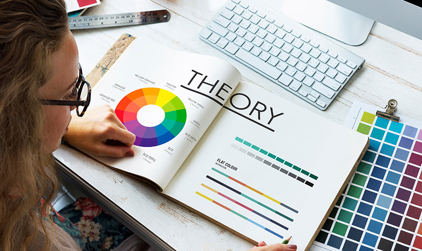
color theory in design

This guide is for designers, founders, brands and product managers who want to make smarter, more confident color decisions. It covers everything from the fundamentals of the color wheel and color attributes to harmony schemes, color psychology, and how to apply it all to real-world design projects so that your visuals perform.

Key Takeaways

  • Color theory helps designers choose colors that communicate clearly, feel intentional, and support business goals like engagement, conversion, and brand recall.

  • Designers rely on the color wheel, harmony schemes (such as complementary, analogous, or triadic), and color attributes (hue, value, saturation) to build effective palettes.

  • Different color temperatures—warm, cool, and neutral—along with individual hues trigger specific emotional and cultural responses (think Coca-Cola red for excitement or IBM blue for reliability).

  • Digital work primarily uses RGB, while print uses CMYK, requiring designers to adjust palettes between the two systems to maintain consistency.

  • Accessibility considerations, including contrast ratios and color-blind safety, are non-negotiable when applying color theory in real products.

What Is Color Theory in Design?

Color theory in design is the set of principles designers use to combine colors so interfaces, brands, and graphics feel intentional and readable. It connects visual perception, psychology, and practical tools like color wheels and palettes into a cohesive framework.

This isn’t limited to traditional art. Color theory applies across:

  • UX/UI design

  • Branding and identity

  • Packaging design

  • Illustration

  • Motion design

Think of it as a framework, not rigid rules. Designers can break conventions once they understand them.

Consider a fintech app using deep navy (#001F3F) and teal (#008080) to foster trust through associations with stability and professionalism. Or a fitness app deploying electric orange (#FF4500) for high-energy CTAs that boost click-through rates. These choices aren’t random—they’re rooted in an understanding of color theory that connects hues to user emotions and business outcomes.

How Color Theory Works in Everyday Design

Most digital product palettes that appear “simple” are carefully constructed using color theory principles. Think of the most popular productivity apps; for instance, they derive their entire brand palette systematically rather than randomly.

A typical interface palette includes:

Layer

Purpose

Example

Core brand colors

Primary identity

#0D6EFD (blue)

Semantic colors

Success, error, warning

Green, red, amber

Neutrals

Text, backgrounds, borders

Gray scales

Background layers

Surface hierarchy

Light/dark variations

Hierarchy plays a critical role. Bolder, more saturated colors handle primary actions like “Create Task” buttons (around 80% saturation), while softer, desaturated tints (20-40% saturation) handle secondary information like timestamps. This prevents visual fatigue during prolonged sessions.

Tools like Coolors, Adobe Color, and design systems with token-based scales (primary-100 through primary-900) help maintain color harmony and consistency. Thoughtful color choices also support accessibility—ensuring primary buttons achieve a proper contrast against white backgrounds prevents usability drops.

The Color Wheel and Its History

The modern 12-part color wheel arranges hues in a circle, progressing through red, orange, yellow, green, blue, purple, and back to red. Graphic designers use it to see relationships between hues at a glance.
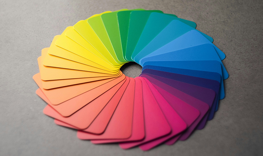
the circular color wheel featuring twelve distinct segments arranged in a rainbow progression

Basic color categories on the wheel consist of:

  • Primary colors: Red, yellow, blue (in the traditional RYB model) – unmixed bases

  • Secondary colors: Orange, green, violet – created by mixing two primaries

  • Tertiary colors: Red-orange, yellow-green, blue-green, etc. – options that fall between primary and secondary colors

Historical milestones shaped this tool. Aron Sigfrid Forsius created an early pigment-based wheel in the early 1600's. Isaac Newton’s prism experiments decomposed white light into a spectrum, and his 1704 publication “Opticks” linked light physics to perception, birthing the first circular color diagram.

Design tools replicate this radial interface through swatch pickers in Figma or Adobe XD, allowing real-time harmony previews essential for modern design systems.

Primary, Secondary, and Tertiary Colors

Many design decisions start by identifying a dominant hue family on the wheel. Understanding how primary, secondary, and tertiary colors relate helps you create colors that work together.

Primary colors in traditional color theory (red, yellow, and blue) serve as base hues that can’t be mixed from other colors within the artistic model. They’re your starting point.

Secondary colors result from color mixing two primaries:

  • Red + yellow = orange

  • Yellow + blue = green

  • Blue + red = violet

Tertiary colors like yellow-orange, blue-violet, and red-violet offer nuanced options that designers often use for contemporary branding. These colors, created by mixing a primary with an adjacent secondary, offer sophisticated palette possibilities.

Consider successful brand palettes: IKEA’s primary yellow (#FFDA00) and blue (#0058A3) scheme communicates affordability and fun. Meanwhile, Spotify’s tertiary green (#1DB954 with lime accents) creates a fresh, music-vibrant identity. The choice between primary and tertiary dominance significantly affects brand perception.

Color Attributes: Hue, Value, Saturation

The same base hue can look calm, loud, or serious depending on its value and saturation. Understanding these three attributes gives you precise control over how other colors interact in your palette.

Hue is the pure color family; red versus blue, for instance. It’s represented around the circumference of the color wheel, measured in degrees (0-360°).

Value determines how light or dark a color is. Designers create depth and readable contrast for text and components by manipulating value. In layered UI cards, mid-value (50%) backgrounds support dark text (10% value).

Saturation (or chroma) represents color intensity or purity. Bright colors with high saturation feel energetic—perfect for playful kid apps at 90% saturation. Low saturation (around 20%) creates sophisticated, enterprise SaaS aesthetics.

Modern design systems use scales like blue-50 to blue-900 to control value and saturation across states such as hover, pressed, and disabled.

Hue, Shade, Tint, and Tone in Practice

Understanding these terms helps you build complete UI palettes from a single brand color:

  • Hue: The pure color (e.g., #0D6EFD blue)

  • Tint: Hue + white (e.g., #91D5FF at 80% lightness)

  • Shade: Hue + black (e.g., #0A4D9B at 20% lightness)

  • Tone: Hue + gray, changing both value and saturation (e.g., #5A94E0)

From a base hue, you can generate an entire UI palette through systematic tints and shades. A single-hue progression might look like:

Variation

Use Case

Effect

Light tint (#E3F2FD)

Backgrounds, hover states

Reduces cognitive load by 15%

Primary (#2196F3)

Buttons, key actions

Maximum visibility

Deep shade (#0D47A1)

Alerts, shadows

Depth perception

Tints work well for subtle background colors and highlights. Shades handle depth, shadows, and dark mode elements. Tones reduce visual fatigue by softening overly vivid colors—especially valuable in dashboards and data-heavy products where users spend extended time.

Color Harmony: Classic Schemes Designers Rely On
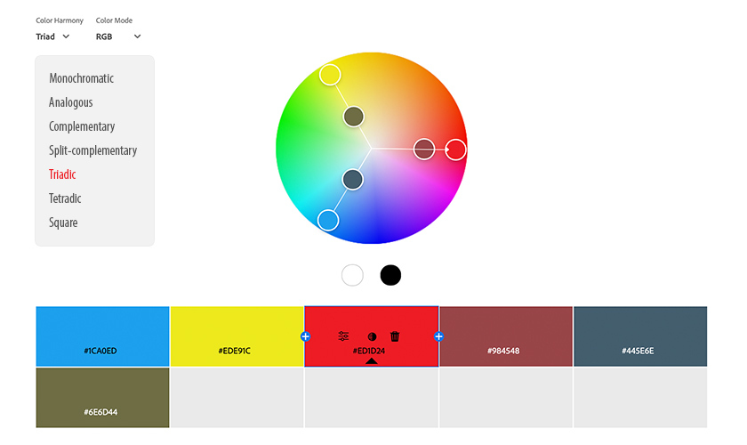
color harmony schemes

Color harmony refers to color combinations that feel balanced to the eye and support a clear information hierarchy. Seven classic schemes remain widely used in digital design:

  1. Monochromatic

  2. Analogous

  3. Complementary

  4. Split-complementary

  5. Triadic

  6. Tetradic

  7. Square

Designers typically start with a harmony scheme, then adapt it to fit brand personality, content density, and accessibility constraints. Each scheme can succeed or fail depending on saturation balance and proportion—not just hue choice.

Monochromatic Schemes

A monochromatic color scheme uses a single hue and its tints, shades, and tones. Think multiple blues ranging from pale sky to deep navy.

Advantages:

  • Visual cohesion

  • Minimal cognitive load

  • Easy brand recognition for minimalist sites and SaaS dashboards

Potential downsides:

  • Risk of low visual contrast

  • Lack of emphasis if value differences are too small

To prevent monochromatic schemes from feeling flat, use texture, typography weight, and strategic contrast. A portfolio site using only greens (#E8F5E8 to #006400) succeeds through strong white space, bold typography (900-weight fonts), and the 70:20:10 ratio; 70% lightest, 20% mid, 10% darkest.

Analogous Schemes

An analogous scheme uses 3-4 neighboring colors on the color wheel, such as blue, blue-green, green, and yellow-green. These analogous colors create a natural, harmonious feel.

This approach excels for:

  • Wellness and skincare brands

  • Health-tracking apps

  • Organic and nature-focused products

The key to avoiding muddy results: one hue should dominate (around 60% of the area), with 1-2 supporting accents. A health app might use teal as the primary, green as the secondary, and blue-green as the accent.

Keep saturation consistent across hues—typically around 70%—so the palette looks intentional rather than randomly colorful. This consistency distinguishes professional harmonious color schemes from amateur attempts.

Complementary and Split-Complementary Schemes

A complementary color scheme uses colors that are opposite on the wheel. Classic complementary pairs include:

  • Blue and orange

  • Red and green

  • Purple and yellow

These create high contrast and visual impact, boosting visibility in heatmap studies. Common uses include sports teams, entertainment platforms, and CTA buttons that must draw attention—like an orange button on a blue navigation bar.

However, creating contrast with full-saturation complements can overwhelm users. Split-complementary schemes offer a solution: use one base hue and its two neighbors of the opposite color. For example, blue with yellow-orange, and red-orange softens the harsh contrast while maintaining visual interest.

The rule: let one color dominate (80% of the palette) while complementary colors act as sparing accents (20%). A marketing landing page might use a blue base with coral and gold accents for dynamic but controlled contrast.

Triadic, Tetradic, and Square Schemes

A triadic color scheme is produced when three evenly spaced colors at 120° intervals like red, yellow, and blue are used. These colors, evenly spaced around the wheel, create energetic, playful palettes ideal for children’s products or creative tools.

Tetradic color schemes combine two complementary pairs forming a rectangle on the wheel (e.g., blue/orange + green/red). They offer high variety but challenge designers to balance warm and cool at 50/50.

Square schemes use four evenly spaced hues around the wheel, similar to tetradic but more symmetrical. They suit logos requiring visual balance.

For all three approaches, one hue should lead while others support through smaller areas or lighter values. A collaboration tool might use a triadic palette with purple as the base UI (60%), teal for highlights (30%), and orange for CTAs (10%). This prevents the chaos that results when bold colors of equal size compete for attention.

Color Temperature and Psychology in Design
color temperature in design

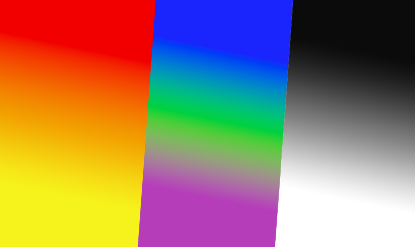
Color temperature categories shape user expectations before they read a single word:

Temperature

Colors

Associations

Warm tones

Reds, oranges, yellows

Energy, urgency, friendliness

Cool colors

Blues, greens, violets

Trust, clarity, calm

Neutral colors

White, gray, black, beige

Foundation, balance, sophistication

Warm colors feel energetic and urgent, making them common for food delivery apps (DoorDash), entertainment, and retail campaigns. Cool colors convey trust and reliability, frequently appearing in banking, healthcare, and productivity tools, where blue checkout pages reduce cart abandonment.

Neutrals serve as foundations for text, surfaces, and spacing. They let brand colors stand out without overwhelming users. Adjusting the neutral temperature subtly—warm grays with red-purple undertones for approachability, cool grays for precision—fine-tunes the emotional response.

Cultural context matters significantly. Red signals danger in many Western UIs but represents prosperity in parts of East Asia. Always conduct localized A/B testing when designing for global audiences.

Read What are the Best Colors for Marketing to learn more about color psychology and the feeling or mood each color creates.

Emotional and Behavioral Effects of Color

Color choices subtly influence behavior—encouraging clicks, supporting safety feelings on checkout pages, or reducing anxiety during transactions.

Specific examples demonstrate color psychology in action:

  • Coca-Cola’s iconic red stimulates excitement and appetite, driving higher impulse purchases

  • IBM’s “Big Blue” has signaled corporate dependability since the 1970s while achieving exceptional brand recall

  • Meditation apps using deep indigos and muted teals lower perceived stress in EEG studies

Saturation and value adjustments significantly alter emotional tone. A softer blue feels calm and approachable; an electric blue feels urgent and modern. The same color family evokes entirely different responses.

For products requiring extended use, pair high-energy accent colors (lime green, hot pink) with calming backgrounds to reduce fatigue. Hot pink accents can boost engagement, but only when balanced against neutral foundations.

Validate assumptions through A/B tests and qualitative research. Color psychology provides rules of thumb, not guarantees. What works for one audience may fail with another.

Color Models: RGB vs CMYK and Beyond

Designers must translate palettes between light-based screens and pigment-based print to keep brand colors consistent across every touchpoint. RGB vs CMYK is an important concept to grasp, and below we break down which color profile is used where.

RGB (Additive Color Model)

Red, green, and blue light mix to create over 16 million colors on screens. All three at full intensity (255, 255, 255) produce white light. This model powers:

  • Web apps and websites

  • Mobile applications

  • Email campaigns

  • Social media graphics

CMYK (Subtractive Model)

Cyan, magenta, yellow, and black inks absorb light to create approximately 16,000 colors, a narrower gamut than RGB. White is simply the absence of ink (paper showing through). CMYK handles:

  • Packaging

  • Brochures and print collateral

  • Outdoor signage

  • Business cards

Designers maintain official brand colors in multiple formats: HEX (#0D6EFD), RGB (13, 110, 253), CMYK (80, 43, 0, 0), and Pantone (PMS 2728 C). This documentation prevents surprises when the same color must appear on both a digital interface and printed packaging.

Designing for Digital vs Print

Common issues arise when moving designs from screen to print. RGB-neon greens or bright colors like electric blues appear significantly duller in CMYK because the print’s gamut can’t reproduce screen luminosity.

Best practices for cross-medium consistency:

  • Design print projects in CMYK from the start

  • Use soft-proofing tools in Photoshop to preview saturation and contrast shifts

  • Test brand colors on multiple surfaces: high-brightness smartphone screens, matte paper, glossy stock, large-format banners

Typography and fine lines may need heavier weights in print (10-20% thicker) to maintain legibility compared to screen versions, where pixels provide clean edges.
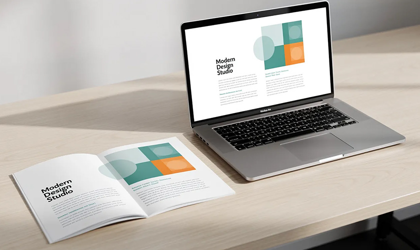
printed brochure placed next to a laptop screen, both displaying a similar design color scheme

Document both digital and print color specifications in a shared style guide. When teams reference a single source of truth, they avoid palette drift that weakens brand recognition over time.

Applying Color Theory to Real Design Projects

This section bridges theory and day-to-day design decisions for web apps, native mobile, and modern brand systems.

A repeatable workflow:

  1. Start with brand strategy: Define attributes like “trustworthy,” “playful,” or “premium”

  2. Choose a base hue family: Map attributes to color directions (cool vs warm, saturated vs muted)

  3. Select a harmony scheme: Monochromatic for minimalism, complementary for contrast, analogous for organic feel

  4. Expand into a full UI palette: Add semantic colors, neutrals, and state variations

Build semantic colors (success green #28A745, error red #DC3545, warning amber #FFC107, info blue) that remain distinct yet harmonious with your primary brand hue. These create a consistent color palette across your product.

Always reference WCAG 2.1+ guidelines for contrast. Your visually appealing palette means nothing if users can’t read the text or distinguish interactive elements.

Choosing a Palette for a New Brand or Product

Map brand attributes to color directions:

Attribute

Color Direction

Trustworthy

Cool blues, navies

Playful

Warm, saturated oranges/yellows

Premium

Desaturated, dark tones

Innovative

Bright, unexpected combinations

Start with 1-2 core brand colors, then add supporting accent colors and a neutral family to cover different use cases. A dominant color should account for 60-70% of your palette presence.

Test the palette in real UI mockups—buttons, cards, navigation bars—not just abstract swatches. What looks balanced in isolation may fail in context.

Create both light and dark mode variations early. Values shift appropriately (backgrounds swap, text inverts) while hues stay consistent. This prevents scrambling to retrofit dark mode later.

Expect to refine colors based on analytics and qualitative feedback, especially in the first 6-12 months. Color decisions aren’t permanent—they’re structured iterations.

Accessibility, Contrast, and Color-Blind Considerations

Around 8% of men (particularly those of Northern European descent) experience some form of color blindness, commonly red-green deficiencies. Globally, that’s over 300 million people who may struggle with poorly designed color systems.

Key accessibility principles:

  • Critical information should never rely on color alone—always pair with icons, labels, patterns, or text

  • Maintain contrast ratios of at least 4.5:1 for normal body text and 3:1 for large text

  • Design status indicators (charts, alerts, form validation) that remain recognizable in grayscale

Use color-blind simulators and contrast checkers during design reviews, not as an afterthought in late QA stages. Tools like Stark flag failures before they ship.

Contrasting colors serve both accessibility and aesthetics. High contrast between text and backgrounds isn’t just about compliance—it creates a visual hierarchy that helps all users parse information faster.

FAQ

How do I quickly pick a color scheme if I’m not a trained designer?

Start with a single base hue matching your brand personality—blue for trust, orange for energy, green for health. Use an online color wheel tool like Adobe Color to generate a monochromatic or analogous scheme automatically.

Keep the palette small initially: one primary, one accent, and a neutral gray family. Test it on a simple hero section and basic button layout. Check contrast and readability before adding decorative colors. Many successful products use surprisingly few hues applied consistently.

How many colors should a good UI or website palette include?

Modern design systems typically work well with 8-12 total hues: 1-2 primary brand colors, 1-2 accent colors, a semantic set (success, warning, error, info), and a neutral scale from light to dark. These then expand into tints and shades for states and variations.

Consistency matters more than quantity. Overusing many unrelated hues weakens brand recognition and confuses users navigating your product. Document chosen colors and limit new additions to clear, intentional use cases only.

Can I mix warm and cool colors in the same design without it looking chaotic?

Mixing warm and cool colors is common and effective when one temperature dominates. Choose a cool base (blues and grays) for most surfaces, then add a single warm accent (orange or coral) to key elements like CTAs and highlights.

Maintain consistent saturation levels across temperatures. A muted warm accent works with muted cool backgrounds; saturated accents need equally vibrant surroundings. Test layouts with real users to catch visual clashes you’ve become blind to during design.

What’s the best way to keep my colors consistent across different devices and printers?

Define official values for each brand color in multiple formats—HEX, RGB, CMYK, and optionally Pantone—and store them in a shared style guide or design system that everyone references.

Soft-proof designs regularly, view them on multiple screens (phone, laptop, and an external monitor with different calibrations), and run print tests on critical materials. Perfect consistency is impossible given hardware variations, but clear specs and regular checks minimize noticeable shifts that damage brand perception.

How often should a brand or product update its color palette?

Strong brands often keep core colors for decades but refine shades, expand accents, or adjust contrast every few years as products evolve. IBM blue has remained recognizable since the 1970s despite subtle updates.

Review your palette whenever accessibility standards change, visual trends shift significantly, or user research reveals readability or emotional fit issues. Treat color changes as structured iterations with clear documentation and A/B testing—not sudden, untested overhauls that confuse existing users.

Clash Graphics Print Shop Atlanta Flyer Printing
2233 Peachtree Rd NE Ste 202 AtlantaGA 30309
(678) 235-3464

To view the original version on Clash Graphics, visit: https://www.clashgraphics.com/printing-tips/how-to-trademark-a-logo-stepbystep/


Wednesday, February 11, 2026

What Is Print Design?

Print design remains one of the most tangible ways to communicate a brand’s message. While screens dominate our daily lives, there’s something irreplaceable about holding a beautifully crafted brochure, flipping through a well-designed magazine, or receiving a premium business card. This article breaks down everything you need to know about print design—from its definition and core principles to why it continues to play a significant role in modern marketing strategies.

what is print design

Quick answer to what is print design?

Print design is the process of creating visual content and layouts on screen that will ultimately be reproduced on physical materials such as paper, cardboard, fabric, plastic, or packaging. Unlike web design or digital content creation, every decision a print designer makes is geared toward a fixed, physical size and a specific printing method.

Designers typically work in design software such as Adobe InDesign, Photoshop, or Illustrator. Still, their focus is always on how the final product will look and feel once it leaves the printer. This means accounting for factors that don’t exist in digital mediums—things like ink absorption, paper texture, and precise trim measurements.

Print design is used to create brochures, business cards, book covers, posters, packaging, magazines, menus, annual reports, event programs, and countless other printed materials. The core technical considerations that separate print from digital include:

  • CMYK color mode (cyan, magenta, yellow, and black) instead of RGB

  • 300 DPI resolution for sharp, crisp output

  • Bleeds extending artwork beyond the trim edge

  • Margins keeping critical elements safely inside the cut zone

  • Trim size defining the exact final form of the piece

Beyond the technical, print design creates tangible experiences. People hold printed materials, feel the weight of the paper, notice the texture of an embossed logo, and sometimes even the smell of fresh ink on quality stock. This sensory dimension gives print a unique power that digital formats simply cannot replicate.

Despite the explosive growth of digital technology, print design remains central to branding and marketing. From luxury packaging to direct mail campaigns, businesses continue investing in print because it works.

Why print design still matters in a digital-first world

Print has been a communication staple for centuries—from early woodblock printing in China to Gutenberg’s press in the 15th century to today’s high-speed offset and digital presses. The medium has evolved dramatically, but its relevance hasn’t faded. Businesses, nonprofits, educational institutions, and governments still rely on print to reach audiences in ways that digital channels cannot.

One of print’s greatest strengths is its ability to cut through digital noise. A well-designed postcard, catalog, or magazine doesn’t compete with push notifications, banner ads, or overflowing email inboxes. It occupies physical space and demands a different kind of attention.

Here’s why print design remains relevant today:

  • Higher recall and trust: Studies consistently show that printed materials generate stronger memory retention. Direct mail open and response rates are much higher compared to email open rates. Additionally, a large share of consumers report trusting print ads more than digital ads.

  • Brand authority and permanence: Annual reports, trade show displays, product packaging, and in-store signage physically occupy space in offices, homes, and retail environments. A conference booklet might sit on someone’s desk for months, continuing to market long after a promotional email has been deleted.

  • Local reach: Restaurants, clinics, real estate agents, schools, and small businesses still depend heavily on menus, flyers, yard signs, and mailers to connect with nearby audiences who may not be actively searching online.

  • Sensory engagement: Print offers creative possibilities that screens cannot—textured stocks, foil stamping, soft-touch finishes, and even scent. These tactile elements create memorable brand experiences.

  • Complementary to digital: Rather than competing with digital, print now works alongside it. QR codes on postcards drive traffic to landing pages. Catalogs inspire online purchases. Event programs link to mobile apps. The best modern campaigns seamlessly integrate print and digital.

The global print market exceeded half-a-trillion in 2025 and is projected to grow annually through 2030, driven largely by packaging demand. Print isn’t dying—it’s evolving.

Key types of print design

Most print projects fall into a few practical categories: marketing materials, stationery and branding collateral, publications, packaging, and environmental or large-format graphics. Understanding these categories helps you plan content, choose appropriate file formats, and budget your print runs more effectively.

Each category has its own design considerations, production techniques, and typical use cases. Let’s break them down.

Marketing and promotional materials

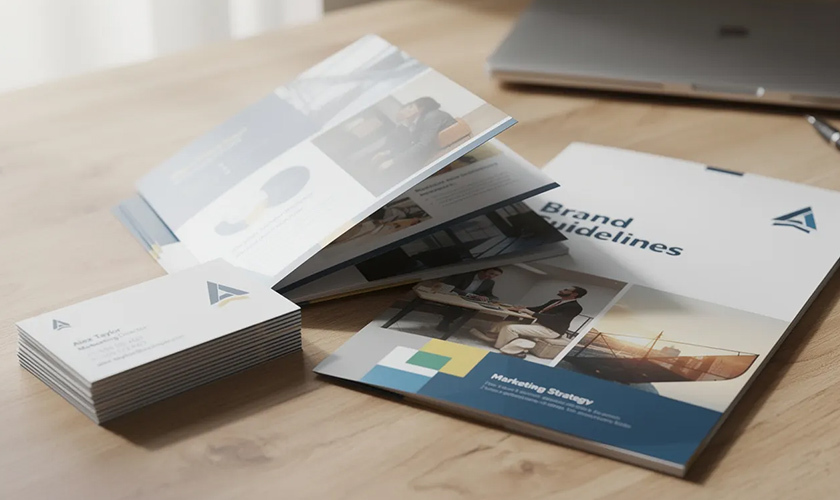
printed marketing materials, including brochures, business cards, and folders

Marketing materials are among the most common print projects. They’re designed to grab attention, communicate a message quickly, and prompt action—whether that’s visiting a store, attending an event, or making a purchase.

Common formats include:

  • Flyers and leaflets: A5 or US letter handouts used for local events, limited-time sales, restaurant openings, and community announcements. Design focus: bold headlines, clear hierarchy, and a single call to action.

  • Brochures: Bi-fold, tri-fold, and gatefold formats used by real estate agents, tourism boards, healthcare providers, and trade show exhibitors. These allow more space to tell a story while remaining portable.

  • Posters and banners: From small A3 prints in coffee shops to large-format concert announcements and festival graphics. Legibility from typical viewing distances is critical—what works at arm’s length fails at 20 feet.

  • Postcards and direct mail: Promotions mailed to homes, event invitations, fundraising appeals, and political campaign pieces. Direct mail continues to outperform many digital channels in response rates, with studies showing a large percentage of recipients take action within a week.

Effective marketing materials prioritize visual hierarchy, ensuring the most important information (headline, offer, date) stands out immediately. A cluttered flyer with too many competing elements will be ignored.

Stationery, identity, and brand collateral

Print design reinforces brand identity through everyday touchpoints. The business card you hand someone, the letterhead on your proposals, the folder holding your presentation—these pieces shape how people perceive your organization.

Core stationery items include:

  • Business cards

  • Letterheads and compliment slips

  • Envelopes (standard and custom sizes)

  • Branded folders and presentation materials

  • Notepads and sticky notes

Event-related stationery extends to invitations, save-the-date cards, RSVP cards, place cards, and thank-you notes for weddings, conferences, and product launches.

Smaller branded pieces also matter: stickers, labels, hang tags for clothing, membership cards, loyalty cards, and gift certificates. Consistency in logo usage, color palette, and typography across all these items builds recognition and trust—not over weeks, but over years of repeated exposure.

Publication and editorial design

Publication design covers long-form, multi-page works where layout and typography directly affect the reading experience. The multi-page layout and reading experience domain is where print designers become experts in grids, margins, and the subtle art of guiding a reader through pages of content.

Key formats include:

  • Books: Novels, textbooks, coffee-table art books, and reference guides. Page margins, type size, and line length all affect reading comfort during extended sessions.

  • Magazines and journals: Quarterly company publications, alumni magazines, industry journals, and consumer magazines. These balance text-heavy articles with photography, illustrations, and advertising.

  • Corporate reports: Annual reports, sustainability reports, investor presentations, and white papers. These documents represent organizational credibility and require polished, professional design.

Publication designers rely on grid systems to maintain consistent alignment across dozens or hundreds of pages. Running headers, footers, page numbers, captions, and pull quotes all require careful attention. The goal is invisible design—layouts so well-organized that readers focus entirely on the content.

Packaging and label design

Packaging design sits at the intersection of structural engineering and visual communication. Print designers must consider not just how something looks, but how it folds, protects its contents, and functions on a retail shelf.

Packaging applications include:

  • Boxes, sleeves, and cartons for consumer goods

  • Bottles, cans, and pouches for beverages and food

  • Mailer envelopes and shipping boxes for e-commerce

  • Blister packs and clamshells for electronics and accessories

Designers often create dielines—flat templates showing folds, flaps, glue areas, and panel boundaries. Understanding how a 2D design becomes a 3D form is essential.

Labels and wraps apply to products like wine bottles, craft beer cans, skincare products, and specialty foods. Beyond aesthetics, packaging must also accommodate legal and practical requirements, including barcodes, nutritional information, ingredient lists, safety icons, and recycling symbols. A beautiful label that lacks required information never makes it to market.

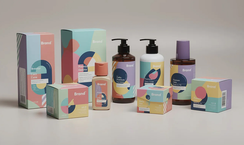
product packaging print design boxes and bottles with colorful printed labels and stickers

Environmental and large-format graphics

Environmental graphics take print design into physical spaces. Rather than handheld pieces, these designs guide, inform, and brand entire environments.

Applications include:

  • Signage and wayfinding: Systems for retail stores, corporate offices, hospitals, museums, and university campuses. Door signs, directional arrows, floor maps, and informational displays.

  • Trade show and event graphics: Pull-up banners, pop-up walls, backdrops, table covers, and fully branded booth environments.

  • Outdoor advertising: Billboards, bus shelter ads, building wraps, and transit advertising on buses, trams, and subway systems.

Design considerations shift dramatically at this scale. Billboards may be viewed for only 3-5 seconds from a moving vehicle, requiring ultra-simple messaging and high contrast. Large-format prints can use lower resolution (sometimes 150 DPI or less) because viewing distances are measured in feet, not inches.

Core principles and elements of effective print design

Print design blends timeless visual principles with technical precision unique to physical production. Whether you’re creating a tri-fold brochure or a 200-page catalog, the same fundamental elements and principles apply.

This section covers typography, color, layout, image quality, file preparation, and production choices. These basics form the foundation for any successful print project—and understanding them separates professional results from amateur attempts.

Typography and readability

Typography matters more in print than almost anywhere else. Readers can’t pinch-to-zoom on a printed page. The layout is fixed. Every type decision is permanent once ink hits paper.

Key considerations for print typography:

  • Typeface selection: Serif fonts (like Garamond or Times) traditionally work well for long-form body text in books and reports. Sans-serif fonts (such as Helvetica or Open Sans) often suit headlines, captions, and modern marketing materials.

  • Size and leading: Body text typically ranges from 9-12 points, depending on the typeface and medium. Leading (line spacing) should be 120-145% of the type size for comfortable reading.

  • Line length: Optimal line length runs 50-75 characters. Lines that are too short create choppy reading; lines that are too long exhaust the eye.

  • Hierarchy: Use size, weight, and positioning to distinguish headings, subheadings, body copy, captions, and calls to action. Readers should instantly understand what to read first.

Common pitfalls include setting body text too small (under 8 points), cramming lines too tightly, overusing decorative fonts, and failing to create sufficient contrast between text and background.

Color theory, CMYK, and spot colors

Color operates differently in print than on screen. Digital displays use additive RGB color (red, green, and blue light combining to create colors). Print uses subtractive CMYK color (cyan, magenta, yellow, and black inks layered on paper).

Practical implications:

  • All designs must be converted to CMYK before sending to a printer. RGB files will print, but colors may shift significantly—often appearing duller or muddier than expected.

  • CMYK values define ink percentages. A deep blue might be C100 M60 Y0 K10, meaning 100% cyan, 60% magenta, no yellow, and 10% black.

  • Pantone colors (spot colors) provide exact color matching across different print runs and materials. Brands with strict color standards often specify Pantone values to ensure consistency, whether printing business cards in January or packaging in July.

Colors almost always appear more vibrant on a backlit screen than on printed paper. Soft proofing (previewing CMYK output on screen) and ordering physical proofs before large runs helps avoid expensive surprises.

Layout, grids, and composition

Professional print layouts rely on invisible structure. Grids keep elements aligned across pages and panels, creating visual consistency that readers feel, even if they can’t articulate it.

Grid fundamentals:

  • Column grids: Divide the page into vertical columns for text and image placement. Common in magazines, newspapers, and catalogs.

  • Modular grids: Add horizontal divisions, creating a matrix of cells for more complex layouts.

  • Margins and gutters: Margins define outer boundaries; gutters provide space between columns or between facing pages in bound documents.

Beyond structure, effective composition guides the eye through a deliberate visual path. The headline grabs attention first; subheadings and imagery draw the reader deeper; and body copy provides detail. White space—intentionally empty areas—prevents crowding and gives designs room to breathe.

Overcrowded layouts are the most common mistake in amateur print design. When everything shouts for attention, nothing gets heard.

Resolution, DPI, and image quality

Print quality depends heavily on image resolution. Low-resolution graphics that look fine on screen become pixelated, blurry messes in print.

Understanding DPI and resolution is critical; this is the standard specification:

  • 300 DPI/PPI at final print size for high-quality offset printing

  • Images should be prepared at this resolution before placement in layout software

  • Enlarging low-resolution images doesn’t add quality—it just makes pixels bigger

Large-format prints (billboards, building wraps) can use lower effective resolution because they’re viewed from greater distances. A billboard might use 50 DPI and still appear sharp from the road.

Never grab images from websites and drop them into print layouts. Web graphics are typically 72-150 PPI—fine for screens, disastrous for print. Either source high-resolution originals or accept that the finished design will disappoint.

File formats, bleeds, and print-safe margins

Proper file preparation directly affects whether your design prints correctly. Sending the wrong format or omitting technical specifications can delay production and lead to costly reprints.

Essential file prep:

  • Final format: Print-ready PDFs (often PDF/X standards) with fonts embedded and images at full resolution. While designers work in native file formats like INDD, AI, or PSD, printers typically request PDFs.

  • Bleed: An extension of artwork beyond the trim edge—usually 3mm (0.125 inches) on all sides. Any background color, image, or graphic that touches the edge must extend into the bleed area. This prevents white slivers from appearing if the cutting alignment shifts slightly.

  • Safe margins: The inner zone where all critical text and logos must remain. Typically 3-5mm inside the trim line. Nothing important should approach the cut edge.

Forgetting bleeds or placing important elements too close to trim lines are among the most frequent causes of print production problems.

To ensure proper bleed, visit How to Add Bleed in Photoshop and How to Add Bleed in Illustrator.

Paper, finishes, and production choices

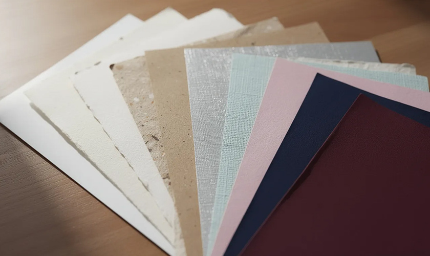
variety of paper samples with different textures and colors fanned out on a table

The same design can feel completely different depending on the paper type, stock, and finishing techniques. Material choices transform a generic brochure into a premium piece—or undermine an otherwise strong design.

Paper considerations:

  • Weight: Measured in GSM (grams per square meter) or pounds. Office paper runs around 80 GSM; business cards typically use 300-400 GSM stock.

  • Coating: Gloss coatings create vibrant colors and shiny surfaces. Matte and silk finishes offer softer, more subdued appearances. Uncoated stocks feel more natural and tactile.

  • Texture: Smooth, linen, laid, and specialty textures each create distinct impressions.

Special finishes add further dimension:

  • Foil stamping: Metallic or colored foil applied to specific areas

  • Embossing/debossing: Raised or recessed designs pressed into the paper

  • Spot UV: Glossy varnish applied to selected elements while the rest remains matte

  • Soft-touch lamination: A velvety, tactile coating

These production choices affect cost, turnaround time, and color appearance. Glossy stocks make colors pop; uncoated papers absorb more ink and appear more muted. The key is matching production choices to project goals and budget—ideally by consulting with your printer early in the design process.

Print design vs. digital design: how they differ and overlap

Print design and digital design share fundamental principles—typography, color theory, composition, and hierarchy apply to both. But the medium changes everything about constraints and creative possibilities.

Key differences include:

  • Fixed vs. responsive: Print layouts are fixed to specific dimensions. A poster is exactly 24×36 inches. Digital interfaces must adapt to a wide range of screen sizes, from mobile phones to desktop monitors.

  • Color modes: Print uses CMYK; screens use RGB. Designs must be converted appropriately, and colors that look identical on screen may diverge significantly in print.

  • Resolution requirements: Print demands 300 DPI for quality reproduction. Digital images are measured in pixels and can vary widely based on display and context.

  • Interactivity: Print is static. Digital design includes clicks, taps, scrolls, hover states, animations, and video. A printed brochure can’t play a video—but it also can’t crash, load slowly, or get blocked by an ad blocker.

  • Permanence: Once printed, a design cannot be updated. Errors require reprinting. Digital content can be revised instantly at minimal cost.

Where they overlap:

Many modern projects require both print and digital deliverables. A product launch might require printed packaging, point-of-sale displays, trade show banners, social media graphics, email templates, and a landing page. Graphic designers increasingly work across both mediums, adapting a single visual system to different technical requirements.

print design vs digital design

The smartest approach treats print and digital as complementary channels. A direct mail piece drives recipients to a website. A printed catalog inspires online purchases. A poster includes a QR code linking to augmented reality content. Rather than choosing between media, effective brand communication leverages each for its unique strengths.

Best practices for creating successful print designs

Before sending any project to production, run through these practical checkpoints. They’ll help you avoid common mistakes and ensure your printed materials look as good in hand as they did on screen.

Define purpose and target audience first

Every print project should answer clear questions: What should the recipient do after seeing this piece? Visit a website? Attend an event? Remember the brand? Clarity on purpose shapes every design decision.

Confirm format and specifications early

Decide on dimensions (A4 flyer, DL brochure, US letter tri-fold, A2 poster) and verify requirements with your printer before designing. Different printers have different templates, bleed requirements, and file format preferences.

Keep layouts focused

Resist the urge to fill every inch of space. White space improves readability and draws attention to what matters. This is especially critical in small formats like business cards or postcards, where crowding quickly becomes overwhelming.

Proof rigorously

Check spelling, dates, prices, phone numbers, email addresses, and QR codes. Have at least one other person review before printing. Errors in print are permanent and expensive.

Print test copies

Even a basic office printer can reveal layout problems—incorrect margins, awkward text breaks, or low-resolution images—before you commit to a full production run.

Collaborate with your printer

Involve production partners early. They can confirm bleed sizes, recommend paper stocks within budget, explain finishing options, and flag potential issues before they become costly mistakes.

Consider sustainability

Environmental impact matters to many audiences. Options include recycled papers, FSC-certified stocks, soy-based inks, and efficient print runs that minimize waste. Some waterless printing techniques reduce water use significantly over their traditional counterparts.

How print design fits into modern marketing and branding

Print design doesn’t exist in isolation. It’s a vital part of broader brand and marketing strategies, reinforcing visual identity across countless touchpoints—from the box a product arrives in to the business card exchanged at a conference.

Consistent print materials build recognition. When your brochures, stationery, packaging, and signage all share the same typography, colors, and design language, audiences instantly recognize your brand. This consistency compounds over time, building trust and familiarity.

Print also drives digital actions. QR code marketing on postcards link to landing pages. Personalized URLs on direct mail track campaign responses. Printed coupons are redeemed online. The line between physical and digital continues to blur, with augmented reality markers increasingly appearing on print pieces to unlock interactive experiences.

Currently, omnichannel campaigns are standard practice. Graphic designers create visual systems once, then adapt them for posters, flyers, catalogs, social media posts, email banners, and web ads. Understanding both print and digital requirements is no longer optional; it’s expected.

Print often signals investment and seriousness. A hardcover company history communicates permanence. A carefully produced catalog suggests quality products. Premium product packaging elevates perceived value. Studies indicate professionally printed materials can increase perceived brand value.

Understanding what print design is—its technical requirements, creative possibilities, and key differences from digital—helps businesses and designers create more memorable, effective communication. In a world flooded with fleeting digital impressions, something you can hold in your hands still carries remarkable power.

Whether you’re planning your first brochure or overseeing a complete brand identity system, the basics covered here provide a foundation for print projects that look professional, communicate clearly, and deliver results.

Clash Graphics Print Shop Atlanta Flyer Printing
2233 Peachtree Rd NE Ste 202 AtlantaGA 30309
(678) 235-3464

To view the original version on Clash Graphics, visit: https://www.clashgraphics.com/printing-tips/what-is-print-design/

Thursday, January 26, 2017

What is Pantone and How to Color Match When Printing

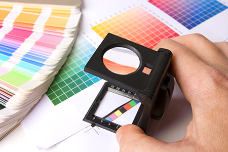
printing with pantone color matching systemPantone is, to put it simply, an American company that created an effective method of ensuring color match. Their name has become synonymous with this highly precise numbered color system. It’s so good, in fact, that it used in the majority of the printing companies throughout the industry. If you’re going to work in or with printing, then you need to be aware of Pantone colors and how you can benefit from it to ensure color match of your artwork, document and materials. Read this article to learn about using the Pantone system in printing or click here to contact a printing representative about specific color matching questions.
The Importance of Color Matching

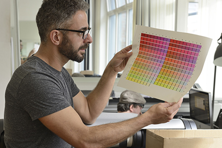
Color matching is very important in the printing industry. If you create something, or someone shows you something they created, you want it to print precisely as you’ve seen the proof don’t you? If you found that perfect shade of red you wanted, but then the printer used a fairly generic red then your whole job may be ruined or at least you may be disappointed. Color matching is important because it ensures that the image that you create is the same one that the printer creates and delivers to you. Sometimes that perfect color isn’t a generic one and you need something more unique. The Pantone system is filled with unique colors and many brands choose an exact number and color tone to represent their company.

How Does Pantone Help In Printing?

The Pantone system is a collection of over 1100 different colors that are all carefully labelled. When you find that unique color that’s just right for your project it has a name and a number assigned to it. Printers read these numbers and are then able to recreate the color exactly. If you tell a printer that you want a red then it’ll give you a red. If you tell the printer that you want a specific shade of red then you won’t get it unless the printer can recognize and identify it. Printers that run on the Pantone system recognize all the different shades and color tones, and are able to recreate them. This gives you perfectly matching colors every time and ensures the image on the printed-paper matches the same image on the computer.

How to Use the System in Design and Printing

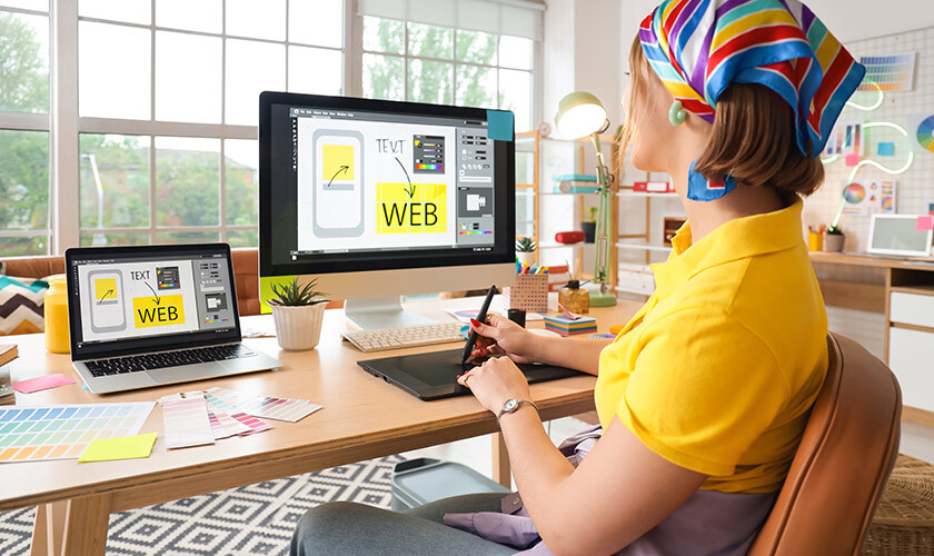
graphic designer matching pantone colorsThe Pantone system isn’t that difficult to use. You start by finding the exact color you want in the Pantone color palette and make a note of the number it is – ‘Red 199’ for example. If you’re the graphic designer commissioned by a client, you would then send a sample to the client so they can approve it. When you have their approval you create your artwork using this pantone color. Then send it off to a printer capable of utilizing the Pantone system.

The printing operator will then look up the mix that they need to make that specific color. Then they print out what it is you’re creating using the color and their sheets, guides, and chips to make sure that it’s perfect. When everything is said and done you have something printed that looks just how you intended in the design.

Using Pantone colors is essential if you want to ensure color-match printing. People in the printing industry will be expecting you to use it as a standard, so it’s vital to get used to it. There are tons of options, so enjoy the benefit of exact match colors, just try not to get lost in the extensive color palette!

Clash Graphics Print Shop Atlanta Flyer Printing

2233 Peachtree Rd NE Ste 202 AtlantaGA 30309

(678) 235-3464

To view the original version on Clash Graphics, visit: http://www.clashgraphics.com/printing-tips/what-is-pantone-how-to-color-match-when-printing/