Content marketing is one of those terms that gets thrown around constantly, but few people can explain what it actually involves beyond "making stuff and posting it." With AI tools reshaping how content gets created and consumed, the definition matters more than ever. This article breaks down what content marketing really is, how it works across the customer journey, the formats that matter most, and how to build a strategy that drives measurable results.

Key Takeaways
-
Content marketing is a strategic, long-term approach to creating and distributing valuable digital content, like blog posts, videos, and podcasts, that attracts and retains a specific target audience and drives profitable customer action.
-
Effective content marketing maps to the full customer journey (awareness, consideration, decision, and post-purchase loyalty), unlike traditional advertising that focuses mostly on interruption and awareness.
-
The main content formats include blog posts, social media posts, video content, email newsletters, podcasts, ebooks, and webinars. Savvy content marketers mix several and repurpose across channels.
-
A successful content marketing strategy follows a simple framework: set business goals, define your audience, choose content formats and channels, build a content calendar in content management software, then measure and refine.
What Is Content Marketing?
Content marketing is the creation of valuable, relevant content designed to attract and engage target audiences-and ultimately drive profitable customer action. Rather than pitching products directly, you create content that solves problems, answers questions, or entertains. The goal is to build trust and nurture customer relationships over time, so that when someone is ready to buy, your brand is top of mind.
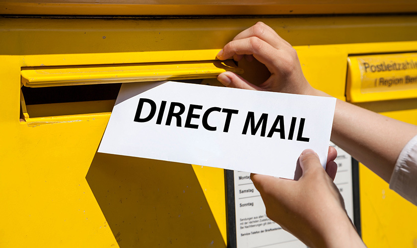
Content marketing is a form of inbound marketing. This core digital marketing strategy deserves a place in your marketing plan. It earns attention by being genuinely useful instead of interrupting people with paid ads. This is how content marketing differs from traditional advertising: unlike traditional advertising, which pushes messages at people who didn't ask for them, content marketing pulls people in because the content itself has value.
Content marketing includes formats such as blogs, videos, and podcasts, as well as social media posts, email newsletters, ebooks, webinars, infographics, interactive tools, and user-generated content. All of these are examples of digital content that can be repurposed across distribution channels.
Here's the critical part: content marketing is not random posting. It's guided by a documented content marketing strategy that connects every digital asset to business goals like lead generation, sales, or retention. Without that strategy, you're just creating noise.
Quality content builds trust and establishes brand authority. That's true whether you're a startup or a Fortune 500.
Think of Airbnb's neighborhood guides-they don't sell rooms directly but build trust by helping travelers with local knowledge. Or Red Bull's extreme-sports videos that turn a drink brand into a media company. These brands succeed because they deliver content that their audience genuinely wants.
How Does Content Marketing Work Across the Buyer Journey?
Effective content marketing maps to key stages of the buyer's journey: awareness, consideration, decision, and post-purchase loyalty. Content marketing should address specific user needs at different stages of the buying journey, and mapping content to the buying process is essential for moving people from "just browsing" to "loyal customer."
Think of it as a funnel. At the top, you're attracting a broad audience with educational content. In the middle, you're helping them evaluate options. At the bottom, you're giving them the proof they need to buy. And beyond the marketing funnel, you're keeping existing customers engaged and turning them into advocates.
A strong content strategy ensures each stage has the right topics, content formats, and calls-to-action. Here's how it breaks down.

Awareness Stage: Attracting the Right Audience
At the awareness stage, potential customers are just realizing they have a problem or goal. They're searching broadly, think queries like "how to reduce customer churn" or "best email marketing tips." They aren't comparing products yet.
Content here must focus on audience pain points and questions, not your product. The job is to educate and build trust.
Best content formats for awareness:
-
SEO-optimized blog posts and how-to articles
-
Explainer videos and social media content (Reels, Shorts, TikTok)
-
Infographics and entry-level guides
-
Top-of-funnel podcasts and social media threads
For example, a B2B SaaS company might publish a trend report on "2026 customer retention strategies," while a DTC brand could release short TikTok tips on sustainable packaging. Neither piece sells anything-they earn attention by being useful.
Metrics at this stage include organic traffic, impressions, new visitors, and social media engagement. You're measuring reach and interest, not direct sales.
Consideration Stage: Evaluating Options
In the consideration stage, people are comparing solutions. They're searching for things like "email platform vs CRM" or "best content marketing platform for startups."
Content should blend education with gentle product positioning. Show how certain approaches or features solve the reader's problem. Content marketing can improve lead quality by attracting targeted customers who are actively researching solutions like yours.
Recommended formats:
-
Detailed comparison guides and blog posts
-
Webinars with live Q&A
-
Case studies with customer stories and real before-and-after metrics
-
Downloadable checklists and email nurture sequences
Key metrics shift toward qualified leads, demo sign-ups, email subscribers, and content downloads.
Decision Stage: Converting to Customers
At the decision stage, prospects are ready to buy. They need proof, reassurance, and clarity on ROI, not basic education. This is where your content marketing efforts directly support the sales process.
Effective formats include:
-
Detailed case studies with concrete numbers
-
Product demo videos and feature comparison pages
-
FAQs and pricing pages with explainer content
-
Customer testimonial videos
Research consistently shows that buyers read between 3 and 7 pieces of content before speaking to sales. That means your decision-stage content needs to be rock-solid and easy to find.
Calls-to-action here are direct: "start free trial," "book a demo," or "talk to sales"-integrated naturally into engaging content.
Post-Purchase: Retention, Expansion, and Advocacy
Content marketing doesn't stop after the sale. Post-purchase content helps reduce churn, increase customer lifetime value, and turn existing customers into advocates. Content marketing builds trust and loyalty with customers over time, and this stage is where that compounds.
Post-purchase content formats:
-
Onboarding email sequences and in-app tutorials
-
Advanced how-to articles and customer webinars
-
User communities and customer-only newsletters
-
Invitations for case study participation and reviews
This content supports upsell and cross-sell opportunities while building customer loyalty. Retention-focused metrics include product adoption rates, repeat purchases, account expansion, and referral volume-all of which connect to long-term business objectives like predictable revenue and lower acquisition costs.
Why Content Marketing Matters
Modern marketing is driven by search engines, social algorithms, and buyer self-education. Buyers do their own research before ever talking to a salesperson. That makes content marketing central to growth for businesses of any size.
-
Content marketing done effectively generates more leads than interruption marketing
-
Most B2B marketers incorporate content marketing into their strategy.
-
Brands with strong content marketing see compounding returns over time, as evergreen blog posts and videos continue to work for years after production and posting.
Content marketing increases brand visibility and organic search traffic, making your brand discoverable without relying solely on paid advertising. Companies with strong content marketing strategies have lower customer acquisition costs because they're earning attention rather than renting it.
At the same time, creating engaging content is increasingly difficult for marketers. AI saturation, zero-click search results, and crowded inboxes mean that only you can differentiate your brand through genuine expertise, personal stories, and a clear point of view. Content marketing aims to drive profitable customer action, but currently, that requires more depth and originality than ever.
Content marketing directly supports common business goals: brand awareness, qualified lead generation, lower acquisition cost, improved sales enablement, and stronger brand loyalty.
Key Types of Content and When to Use Them

Brands rarely rely on a single format. Instead, savvy content marketers mix several content formats and repurpose them-a webinar becomes video clips, a blog post, and an email series. Savvybusinesses use infographics and video as tools in their marketing strategies. The variety is what keeps your social media presence and website fresh.
All of these formats live inside a broader content management system or content marketing platform, which helps organize, publish, and measure your content marketing initiatives.
Blog Posts and Long-Form Articles
Blog posts are the backbone of many content strategies. They drive organic search traffic, provide depth on topics your audience cares about, and are ideal for awareness and consideration stages.
Many internet users at some point during reseach read blog content, which makes blog posts one of the most reliable ways to reach potential customers through search engines. SEO is important for content distribution to enhance visibility. Strong blog content requires a clear structure, keyword research, internal links, and compelling calls-to-action.
Types of blog posts that work well:
-
How-to guides and tutorials
-
Thought-leadership essays with a contrarian take
-
Industry trend breakdowns
-
"Ultimate guides" that cover a topic comprehensively
-
Product comparisons (consideration stage)
Blogs remain core to most content marketing systems. They're a foundational piece of any effective content marketing strategy.
Social Media Content
Social media posts are fast-moving, short-form content designed for brand visibility, social media engagement, and community building. They're not meant for deep education-they're the teaser that drives people to your longer content.
Different social media platforms support different audiences:
|
Platform |
Best For |
Primary Format |
|---|---|---|
|
|
B2B, professionals |
Text posts, articles, carousels |
|
TikTok |
Gen Z, B2C |
Short-form video |
|
|
Visual brands, lifestyle |
Reels, carousels, Stories |
|
YouTube |
Tutorials, long-form |
Video (short and long) |
|
X (Twitter) |
News, quick takes |
Text threads, links |
A simple approach: tease value, link to the main content piece, and invite interaction. Your social media strategy should support your broader content strategy, not replace it. Social media marketing metrics include reach, engagement rate, click-through to longer content, and follower growth.
Video Content
Video content is one of the most engaging content formats available. The best marketers use video as a key tool, and plan to increase their video content production. That's not a trend-it's the default.
Short-form video (15–60 seconds on Reels, Shorts, TikTok) works best for awareness-quick tips, brand stories, and behind-the-scenes clips. Long-form video (YouTube tutorials, webinar recordings, interviews) is better for consideration and decision stages, where you can walk through features, share customer stories, or demonstrate ROI.
One video can be repurposed into multiple digital assets: transcripts for blog posts, snippets for social, and GIFs for email. Video performance is tracked via views, watch time, click-through, and conversions driven from video CTAs.

Podcasts and Audio Content
Podcasts are effective for developing relationships with niche audiences who listen while commuting, working out, or doing chores. Audio content creates a sense of intimacy and thought leadership that text alone can't match. The number of podcast listeners worldwide is estimated to reach 619 million.
Podcast themes that work: expert interviews, behind-the-scenes company stories, industry news roundups, or deep dives into customer challenges. They're especially strong for awareness and loyalty stages.
Basic podcast metrics include downloads, completion rates, listener retention, and sign-ups traced back to podcast-specific URLs or codes. Audio content can be repurposed into blog posts, social clips, and quote graphics-communicating complex ideas in accessible formats.
Email Newsletters
Email is a high-ROI owned channel, independent of social or search algorithms, and is one of the most cost-effective ways to deliver content directly to your audience.
Newsletters can curate blog posts, share product updates, deliver exclusive how-to content, or offer personalized recommendations. Email content works across all funnel stages, from welcoming new subscribers to promoting webinars, demos, and loyalty programs for existing customers.
Key metrics: open rate, click-through rate, unsubscribe rate, and revenue per subscriber. List building through lead magnets (ebooks, checklists, templates) remains a critical part of any effective content marketing program.
Ebooks, White Papers, and Long-Form Guides
Ebooks and white papers are deep, structured resources that dive into a topic in detail. Many B2B marketers use white papers in their B2B content marketing strategy.
These formats are valuable lead magnets at the consideration stage, often gated behind simple forms that capture email addresses and company info. Good topics include industry benchmarks, content marketing statistics, ROI frameworks, or step-by-step implementation guides tied to business goals.
Design and scannability matter: use headings, charts, and visuals to keep long-form content readable. Performance is judged on downloads, lead quality, and influenced pipeline or revenue.
Webinars and Live/Virtual Events
Webinars and virtual events combine education with real-time Q&A and demo opportunities. They often sit in the consideration or decision stages, where prospects are engaged enough to commit 30–60 minutes.
Examples: "How to Build a Content Strategy" live sessions, product training events, or customer panel discussions. Webinars provide rich engagement data, registrations, attendance rate, drop-off points, poll responses, and post-event conversions.
Recorded webinars can be repurposed into on-demand video, blog posts, and email sequences, extending the value of a single event across multiple distribution channels.
Content Marketing vs. Content Strategy, Management, and Platforms
"Content marketing," "content strategy," and "content management" are related but different concepts that often get confused. Understanding how strategy, content creation, and tools fit together will make your content marketing efforts more efficient and focused.
Content Marketing vs. Content Strategy
Content strategy is the overarching plan that aligns content with business goals, audience needs, messaging, and governance-who approves what, how often you publish, brand voice, and editorial standards.
Content marketing is the execution side: using that strategy to actually create content, publish it, and distribute it.
Here's an example: your content strategy might specify "publish two SEO blog posts and one customer story per week targeting mid-market SaaS buyers." Content marketing is the work of writing, designing, and promoting those assets. Successful teams document their strategy before ramping up content creation-a documented content marketing strategy is what separates consistent performers from teams that burn out.
Content Management Software (CMS) and Content Services
Content management software lets your marketing team create, edit, and publish content on websites without heavy IT involvement. A CMS acts as the hub for blog posts, landing pages, and digital assets, making it easier to keep relevant content updated and consistent.
More advanced content services platforms handle documents, media, and records across the business, not just marketing, supporting compliance and collaboration. The practical benefit: scheduling posts, managing contributors, and tracking basic performance in one place.
What Is a Content Marketing Platform?
A content marketing platform is software that supports upstream content processes: planning, ideation, editorial calendars, collaboration, approvals, and performance dashboards. It helps content marketers coordinate campaigns across channels and maintain a unified content calendar.
Typical features include topic recommendations, workflow management, asset libraries, and integration with analytics tools like Google Analytics. A content marketing platform differs from a CMS in that it manages planning and strategy execution, while the CMS handles website publishing.
As teams grow, with multiple content marketers, designers, and stakeholders, a platform becomes essential to avoid chaos and ensure consistent distribution of content.

How to Create a Content Marketing Strategy (Step-by-Step)
This is a practical framework that a marketer at a small or mid-sized business could start using this quarter. A successful content marketing strategy should be realistic, documented, and revisited at least quarterly.
1. Tie Your Content to Clear Business Goals
Every content program should start with specific business goals. Examples:
-
"Increase qualified leads by 30%"
-
"Reduce churn by 5% in 12 months"
-
"Grow organic traffic by 50% over 6 months"
Goals determine your key performance indicators-traffic, leads, trial sign-ups, demo requests, revenue, or retention metrics. Choose 1–3 primary goals to keep focus and avoid scattered content marketing budgets.
For instance, if your goal is organic lead generation, you might commit to publishing two SEO blog posts and one customer story monthly. This alignment makes it easier to justify content marketing budgets and measure ROI.
2. Define and Research Your Target Audience
Target audience personas define content and tone in content marketing. Content marketing relies on deep audience understanding and strategic planning-without it, you're guessing.
Build buyer personas using:
-
CRM data and customer interviews
-
Support tickets and sales call notes
-
Social listening and keyword research tools
-
Competitor content analysis
Focus initially on one or two priority segments. A sample persona: "Marketing manager at a SaaS company, needs to show pipeline impact, prefers LinkedIn and long-form guides, frustrated by generic advice." Understanding language, objections, and success criteria shapes your tone, topics, and offers.
3. Choose Content Topics, Formats, and Channels
Identify 3–5 content pillars that align with both audience interests and business objectives. For each pillar, list potential topics and match them to formats and channels.
Use a mix of approaches to generate content ideas:
-
Quick wins: Short blog posts, social threads, email tips
-
Big bets: In-depth guides, original research reports, video series
Keyword research supports topic selection by revealing what people actually search for. Channel choice should follow the audience: professionals on LinkedIn and YouTube, Gen Z on TikTok and Instagram. This is how you build an effective content marketing strategy that actually reaches people.
4. Plan a Realistic Content Calendar
A content calendar shows what you will publish, when, where, and who is responsible. Maintaining a content calendar ensures consistent content publication and keeps your marketing team accountable.
Practical tips:
-
Plan 3–6 months ahead at a high level
-
Leave room to react to news or fresh ideas each month
-
Start with a sustainable cadence (e.g., one blog post and two social media posts per week, one newsletter per month)
-
Use content management software or even a simple spreadsheet to track statuses: idea → drafting → editing → published
Don't overcommit. A consistent, manageable cadence beats an ambitious plan that collapses by month two.
5. Measure Performance and Refine Your Approach
Content marketing is an ongoing experiment. Measuring content marketing ROI involves tracking key performance indicators like website traffic, lead generation, and conversion rates. Use analytics tools and Google Analytics to see what's working.
Review performance monthly and quarterly:
-
Double down on winning topics and formats
-
Sunset or rework underperformers
-
A/B test headlines, CTAs, and email subject lines
Over a 6–12 month window, patterns emerge that help refine strategy, budget, and resource allocation. Measuring content marketing ROI can be complex and challenging, but even simple ratios, such as leads per post, revenue influenced by content-sourced leads, provide valuable insights.

Frequently Asked Questions About Content Marketing
How long does it take for content marketing to show results?
Most businesses start seeing meaningful leading indicators-more organic traffic, subscribers, and social media engagement-after 3–6 months of consistent publishing. Stronger ROI, like qualified leads and sales, typically emerges over 6–12 months.
Timeline depends on competition, domain authority, publishing frequency, and how well you're distributing valuable content. Treat content marketing as a long-term investment rather than a quick-win campaign, while still tracking short-term improvements in online visibility and engagement.
What budget do I need to start content marketing?
Budgets vary widely. Small businesses may start with a few hundred to a few thousand dollars per month, covering writing, design, and basic tools. Larger organizations often invest tens of thousands monthly, especially when producing video content or original research.
Prioritize a few core activities, like one strong blog post per week and a monthly newsletter, before adding expensive formats. Track cost per lead from content over time to justify and adjust your content marketing budgets.
Is content marketing different for B2B and B2C brands?
The core principles-provide value, build trust, support the buyer's journey-are the same. But execution differs.
B2B content often focuses on longer sales cycles, multiple stakeholders, and formats like white papers, webinars, and in-depth case studies. It emphasizes logic, ROI, and developing content for engaging audiences across a complex sales process.
B2C usually relies more on emotional storytelling, shorter formats (social media content, short-form video), and lifestyle-driven content to drive quicker purchases and build brand reputation.
How do I measure the ROI of content marketing?
ROI requires connecting content metrics (traffic, leads, engagement) to business outcomes (revenue, retention, reduced support costs) over time. Common KPIs include website traffic, lead generation, and conversion rates.
Set up basic attribution: tracking URLs, UTM parameters, and CRM fields to see which blog posts, videos, or emails influenced deals. Start with simple ratios like leads per post, revenue influenced by content-sourced leads, and cost per lead compared to paid advertising.
Does content marketing still work with so much AI-generated content?
Content marketing remains highly effective, but audiences are more selective. With AI making it easy to generate content ideas and produce drafts at scale, originality, depth, and brand perspective matter more than ever.
AI can speed up research and developing content, but brands win by adding unique insights, proprietary data, strong storytelling, and clear opinions that generic content lacks. According to recent surveys, roughly 97% of content marketers use AI tools in some capacity, but teams are shifting toward human oversight for quality control. Focus on high-quality content, a recognizable brand voice, and personal stories to stand out. Becoming an industry leader requires engaging audiences with perspectives that only you can provide.
(678) 235-3464
To view the original version on Clash Graphics, visit: https://www.clashgraphics.com/printing-tips/what-is-content-marketing/