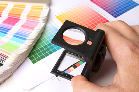
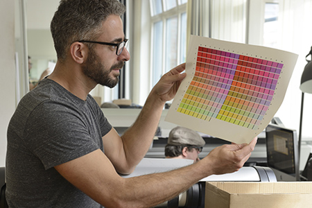
 Pantone is, to put it simply, an American company that created an effective method of ensuring color match. Their name has become synonymous with this highly precise numbered color system. It’s so good, in fact, that it used in the majority of the printing companies throughout the industry. If you’re going to work in or with printing, then you need to be aware of Pantone colors and how you can benefit from it to ensure color match of your artwork, document and materials. Read this article to learn about using the Pantone system in printing or click here to contact a printing representative about specific color matching questions.
The Importance of Color Matching
Color matching is very important in the printing industry. If you create something, or someone shows you something they created, you want it to print precisely as you’ve seen the proof don’t you? If you found that perfect shade of red you wanted, but then the printer used a fairly generic red then your whole job may be ruined or at least you may be disappointed. Color matching is important because it ensures that the image that you create is the same one that the printer creates and delivers to you. Sometimes that perfect color isn’t a generic one and you need something more unique. The Pantone system is filled with unique colors and many brands choose an exact number and color tone to represent their company.
How Does Pantone Help In Printing?
The Pantone system is a collection of over 1100 different colors that are all carefully labelled. When you find that unique color that’s just right for your project it has a name and a number assigned to it. Printers read these numbers and are then able to recreate the color exactly. If you tell a printer that you want a red then it’ll give you a red. If you tell the printer that you want a specific shade of red then you won’t get it unless the printer can recognize and identify it. Printers that run on the Pantone system recognize all the different shades and color tones, and are able to recreate them. This gives you perfectly matching colors every time and ensures the image on the printed-paper matches the same image on the computer.
How to Use the System in Design and Printing
 The Pantone system isn’t that difficult to use. You start by finding the exact color you want in the Pantone color palette and make a note of the number it is – ‘Red 199’ for example. If you’re the graphic designer commissioned by a client, you would then send a sample to the client so they can approve it. When you have their approval you create your artwork using this pantone color. Then send it off to a printer capable of utilizing the Pantone system.
The printing operator will then look up the mix that they need to make that specific color. Then they print out what it is you’re creating using the color and their sheets, guides, and chips to make sure that it’s perfect. When everything is said and done you have something printed that looks just how you intended in the design.
Using Pantone colors is essential if you want to ensure color-match printing. People in the printing industry will be expecting you to use it as a standard, so it’s vital to get used to it. There are tons of options, so enjoy the benefit of exact match colors, just try not to get lost in the extensive color palette!
Clash Graphics Print Shop Atlanta Flyer Printing
2233 Peachtree Rd NE Ste 202 Atlanta, GA 30309
(678) 235-3464
To view the original version on Clash Graphics, visit: http://www.clashgraphics.com/printing-tips/what-is-pantone-how-to-color-match-when-printing/
No comments:
Post a Comment