Showing posts with label MArketing Materials. Show all posts

Wednesday, October 21, 2026

What Is Offset Printing?

Offset printing is an indirect printing technique where ink is transferred from a plate to a rubber blanket and then onto paper or another substrate. Also known as offset lithography, it was developed in the late 19th century as lithography evolved and remains one of the most widely used printing techniques in the world today.
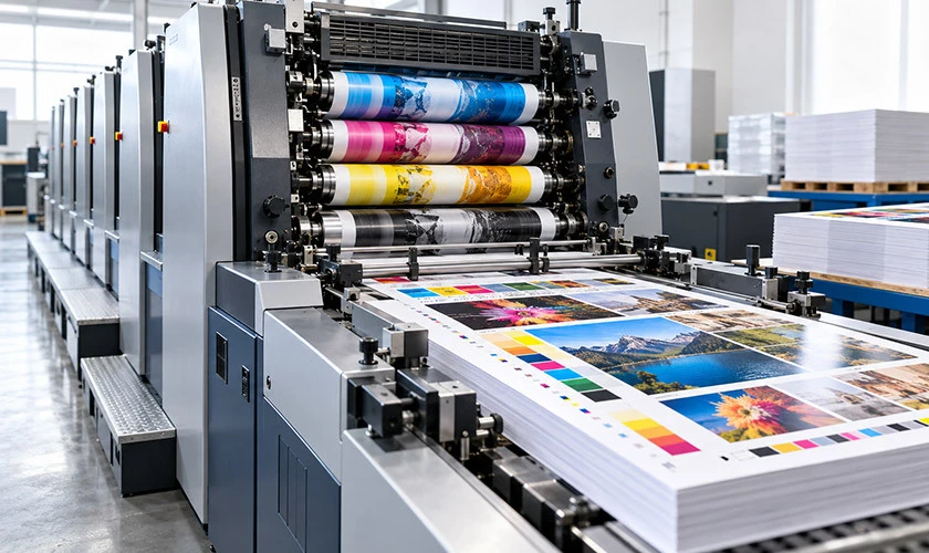
what is offset printing

The offset printing process relies on the principle that oil and water do not mix. Oil-based ink adheres only to the image areas on the plate, while water-dampened non-image areas repel it. This allows for the precise application of ink to specific areas. Unlike digital printing, which uses toner or inkjet heads and requires no plates, offset printing uses physical printing plates for each color and is ideal for high-volume commercial printing.

  • High volume efficiency: Cost per unit drops significantly as quantities increase, making it cost-effective for large print runs.

  • Exceptional quality: Produces high-quality prints with sharp details, vibrant colors, and smooth tonal transitions.

  • Consistency: Once the press is dialed in, it delivers consistent prints across thousands or millions of copies.

  • Substrate versatility: Offset printing can work on a diverse range of materials and finishes, including textured papers and card stock.

  • Special inks and coatings: Supports spot colors, metallics, varnishes, and UV coatings for premium printed materials.

How Offset Printing Works: Step-by-Step Offset Printing Process

Understanding how offset printing works starts with seeing it as a chain of precise steps, from a digital file on a designer's screen to a finished sheet rolling off the press. The entire job flows through pre-press preparation, plate making, press setup, inking, dampening, image transfer, and finishing.

Modern offset presses usually print in CMYK, with one printing unit and one plate per process color. Each color in offset printing requires a separate plate. Here is how each stage breaks down.

Preparing the Printing Plate and Pre-Press

Pre-press is where every detail gets locked down before ink ever touches paper. The offset printing process begins with preparing the printing plate, and errors caught here save significant time and money later.

  • Digital files (typically PDFs) are checked for resolution (300 dpi minimum for images), embedded fonts, and correct color mode. RGB files are converted to CMYK for the printing process.

  • Computer-to-plate (CTP) technology images aluminum printing plates directly from the digital file, eliminating older film-based workflows in most modern printing works.

  • Imposition arranges multiple pages onto a single press sheet to minimize paper waste and streamline finishing.

  • Each process color - cyan, magenta, yellow, and black - gets its own plate and its own printing unit on the press.

  • Proofing is a crucial step: both soft proofs (on-screen) and physical contract proofs help verify color and layout before plates are made. Errors in offset printing setup can lead to costly mistakes, since remaking plates adds time and expense.

The Dampening and Inking Systems

The dampening and inking systems work together on the plate to separate what prints from what stays blank.

  • The dampening system applies water (fountain solution with buffering agents) to the non-printing areas of the plate, keeping them moist so they repel the oily ink.

  • The inking system uses a series of ink rollers to meter and distribute ink evenly before it reaches the image areas on the plate. The inking system controls the amount of ink applied to the plate.

  • Maintaining a stable ink-water balance is critical. Too much water washes out detail; too little causes scumming, where ink contaminates non-image areas. Operators monitor pH, conductivity, and roller pressure throughout the run.

Transferring the Image: Plate, Blanket, and Impression
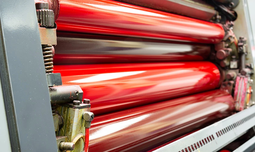
industrial cylinders on a printing press, visible ink on the surface of the offset printing process

Three cylinders do the heavy lifting in every printing unit: the plate cylinder, the blanket cylinder, and the impression cylinder.

  • The inked image is transferred first from the plate cylinder to the rubber blanket - this is the "offset" step that gives the method its name. Because the plate never touches the paper directly, it lasts longer and delivers cleaner results.

  • The rubber blanket is flexible enough to conform to slightly textured or uneven printing surfaces, producing clean images on both coated and uncoated stocks.

  • The substrate (paper, board, or other material) passes between the blanket cylinder and the impression cylinder. Controlled pressure ensures the ink transferred from the blanket produces high-quality images on the final product.

The Offset Printing Press: Sheet Fed vs. Web Fed

Offset printing includes sheet-fed and web-fed processes, and choosing the right one depends on run length, budget, and the type of final product you need.

  • Sheet-fed offset printing: Sheet-fed presses print on individual sheets of paper fed one at a time. Sheet-fed printing can produce up to 24,000 sheets per hour on modern commercial presses. Common applications include brochures, business cards, folding cartons, and books. Setup costs are lower, and waste during makeready is minimal, making sheet-fed ideal for runs from a few hundred to tens of thousands.

  • Web-fed presses: Web-fed presses print on large rolls of paper in a continuous feed. Web offset printing can produce over 3,000 papers per minute, and overall, offset printing can produce up to 80,000 sheets per hour on high-speed web configurations. This makes web presses the standard for newspapers, magazines, catalogs, and direct mail. Web presses use either heatset drying (for coated stocks) or coldset drying (for uncoated stocks like newsprint). Quick-set printing allows for faster drying of printed materials in many configurations.

  • Key trade-offs: Sheet-fed offset printing offers lower makeready waste and faster job changeovers. Web-fed presses require more startup waste but deliver unmatched throughput for large volumes. Inline finishing (folding, cutting, perforating) is common on web presses.

Key Components of an Offset Printing Press

Every offset press, whether sheet-fed or web-fed, shares a core set of components:

  • Feeder or reel stand: Feeds individual sheets or unwinds large rolls of paper into the press.

  • Printing units: One per ink color (typically four for CMYK), each containing its own plate cylinder, blanket cylinder, impression cylinder, and sets of ink rollers and dampening rollers.

  • Delivery section: Collects printed sheets or routes the web through folders, cutters, and stackers.

  • Control console: Operators monitor registration, color density, and ink-water balance in real time. Modern offset presses often include automatic plate changers, in-line spectrophotometers, and closed-loop color control systems that adjust ink keys automatically.

Offset Lithography vs. Digital Printing

Offset lithography and digital printing are complementary printing methods - each excels in different industries and job types. The right choice depends on quantity, turnaround time, and the type of printed materials you need.

  • How they work: Offset printing works through plates, indirect transfer via a rubber blanket, and wet ink. Digital printing sends digital files directly to toner or inkjet heads with no plates required.

  • Cost: Offset printing is cost-effective for large-volume print jobs where the setup costs are spread across thousands of units. Setup costs for offset printing can be high for small runs. Digital printing wins for smaller quantities where per-unit cost matters less than avoiding plate charges.

  • Quality: Offset delivers extremely fine detail and consistent color across large quantities, making it the standard for producing high-quality prints in commercial printing. Digital quality has improved dramatically, but offset still leads for premium work with spot colors and specialty finishes.

  • Turnaround: Offset printing requires longer preparation times compared to digital printing. Digital can go from file to output in minutes; offset needs plate imaging, makeready, and drying time.

  • Variable data: Digital printing supports variable data printing - personalizing each piece with unique names, addresses, or codes. Offset prints the same image across every sheet in the entire job.

  • Substrates and finishing: Offset can accommodate various printing surfaces like cardboard and metal, and supports other printing methods like foil stamping. Digital presses have narrower substrate ranges depending on the technology.

Read the following to learn more about the differences of digital vs offset printing.

Applications of Offset Printing in Commercial Printing

Offset printing is the backbone of high-volume commercial printing across different industries worldwide.

  • Publishing: It produces high-quality prints for newspapers and magazines, as well as books and catalogs, where consistent color and sharp text across large print runs are non-negotiable.

  • Marketing materials: Offset printing is commonly used for printing brochures and marketing materials, including flyers, product sheets, presentation folders, posters, and direct mail pieces.

  • Corporate identity: Letterheads, envelopes, and business cards benefit from offset's precise color matching and professional feel, which plays a significant role in branding.

  • Packaging: Offset printing is used for packaging materials like boxes and labels, particularly high-graphic folding cartons that demand high-quality output with detailed images and accurate brand colors.
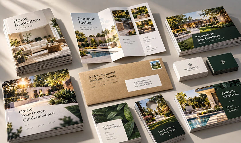
stacks of colorful printed brochures, magazines, and packaging materials on a table, showcasing high-quality from offset printing

Color in Offset Printing: CMYK, Pantone, and Color Management

CMYK is the color model used in most offset printing, consisting of cyan, magenta, yellow, and black. Each color is laid down by its own plate and printing unit, creating tiny halftone dots that visually blend into full-color, high-quality images.

  • CMYK process color: Four plates produce the full spectrum of printable color. Dot gain - how much dots spread on the substrate - must be calibrated using industry standards like GRACoL or SWOP to ensure predictable results.

  • Spot colors (Pantone): Pantone colors can be used in offset printing for precise color matching. Pre-mixed Pantone inks handle brand-critical hues, metallics, and fluorescents that fall outside the CMYK gamut. Each spot color adds a plate and unit.

  • Color management: Calibrated monitors, ICC profiles, and on-press measurement with densitometers and spectrophotometers keep color accurate from graphic design file to final product. This is a crucial role that pre-press and press operators share.

  • Practical decision: Use CMYK-only for general full-color work. Add Pantone spot colors when a logo or brand element demands exact color fidelity - the extra cost is justified when brand consistency across marketing materials is critical.

Advantages and Limitations of Offset Printing

Offset printing remains a leading printing technique because its strengths align with the demands of most medium-to-large commercial print jobs.

Advantages:

  • Offset printing produces high-quality images with sharp details and smooth tonal gradations, especially on coated papers.

  • Delivers vibrant colors and consistent results across thousands or millions of copies.

  • Very low cost per unit for high volume printing, with strong cost effectiveness as quantities increase.

  • Works across a wide range of substrates, including paper, board, plastics, and specialty stocks.

  • Supports special inks and post-press finishes: metallic inks, varnish, spot UV, embossing.

Limitations:

  • Higher setup costs and makeready time compared to digital printing, making it less economical for small print runs.

  • Longer turnaround time when plate production, press calibration, and drying are factored in, which can be time-consuming for rush jobs.

  • Design changes after plate creation are expensive - careful proofing during the pre-press stage is essential.

  • The printing process requires skilled operators to manage ink-water balance, registration, and quality control.

From File to Finished Piece: Pre-Press, Printing, and Post-Press
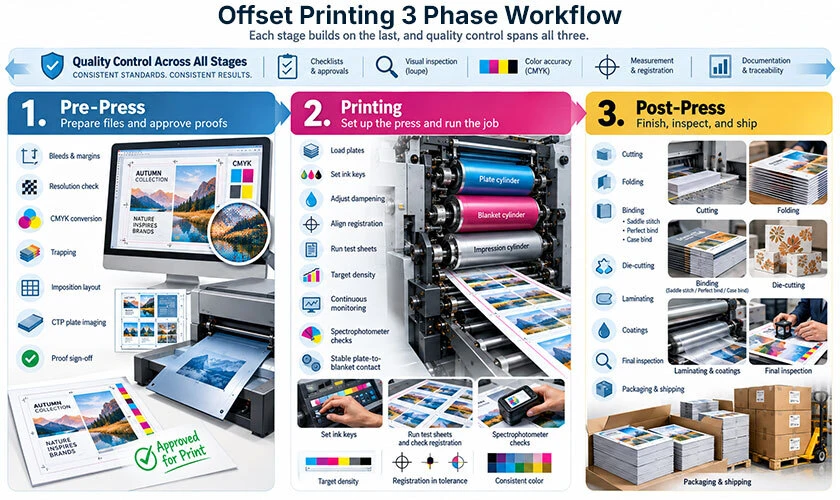
offset printing three-stage workflow

Successful offset printing follows a three-stage workflow. Each stage builds on the last, and quality control spans all three.

  • Pre-press: File preparation includes checking bleeds, margins, resolution, and color conversion to CMYK. Trapping prevents white gaps between colors. Imposition layouts and plate imaging via CTP complete this stage. Every proof sign-off here prevents costly reruns.

  • Printing: Plates are loaded, ink keys and dampening levels set, and registration aligned. Test sheets are run until color and registration hit target density. The entire job is then printed with continuous monitoring - operators sample sheets and use spectrophotometers to catch drift. The image carrier (plate) must remain in stable contact with the blanket throughout.

  • Post-press: Post-press includes cutting and finishing the printed materials. This final step also involves folding, binding (saddle stitch, perfect bind, case bind), die-cutting, laminating, and applying coatings. The final product is inspected for trim accuracy, fold alignment, and color consistency before packaging and shipping.

Environmental Impact and Modern Developments in Offset Printing

Traditional offset printing consumes paper, ink, chemicals, and energy. However, modern printing companies actively work to reduce their environmental footprint through better technology and responsible practices.

  • Sustainable substrates and inks: FSC- and PEFC-certified papers, recycled stocks, and vegetable-based or low-VOC inks are increasingly standard. Some ink manufacturers now offer bio-based heatset inks that significantly cut emissions.

  • Press efficiency gains: Faster makeready, automated color control, and closed-loop systems reduce paper spoilage. Alcohol-free dampening solutions eliminate a major source of VOC emissions.

  • Waste handling: Used aluminum printing plates are recyclable. Paper offcuts, blankets, and processing chemicals are managed under environmental regulations.

  • Emerging technology: LED-UV curing systems dry ink faster with lower energy consumption and reduced heat impact on substrates. Waterless offset printing eliminates fountain solution entirely, producing sharper prints with less chemical waste.

  • Looking ahead: Ongoing innovations in automation, hybrid printing workflows (combining offset with digital for variable data printing), and greener chemistry keep offset printing competitive alongside digital printing in both quality and sustainability. For printing companies evaluating their options, offset remains a proven, evolving method that continues to deliver high-quality output at scale.

Clash Graphics Print Shop Atlanta Flyer Printing
2233 Peachtree Rd NE Ste 202 Atlanta, GA 30309
(678) 235-3464

To view the original version on Clash Graphics, visit: https://www.clashgraphics.com/printing-tips/what-is-offset-printing/


Wednesday, February 11, 2026

What Is Print Design?

Print design remains one of the most tangible ways to communicate a brand’s message. While screens dominate our daily lives, there’s something irreplaceable about holding a beautifully crafted brochure, flipping through a well-designed magazine, or receiving a premium business card. This article breaks down everything you need to know about print design—from its definition and core principles to why it continues to play a significant role in modern marketing strategies.

what is print design

Quick answer to what is print design?

Print design is the process of creating visual content and layouts on screen that will ultimately be reproduced on physical materials such as paper, cardboard, fabric, plastic, or packaging. Unlike web design or digital content creation, every decision a print designer makes is geared toward a fixed, physical size and a specific printing method.

Designers typically work in design software such as Adobe InDesign, Photoshop, or Illustrator. Still, their focus is always on how the final product will look and feel once it leaves the printer. This means accounting for factors that don’t exist in digital mediums—things like ink absorption, paper texture, and precise trim measurements.

Print design is used to create brochures, business cards, book covers, posters, packaging, magazines, menus, annual reports, event programs, and countless other printed materials. The core technical considerations that separate print from digital include:

  • CMYK color mode (cyan, magenta, yellow, and black) instead of RGB

  • 300 DPI resolution for sharp, crisp output

  • Bleeds extending artwork beyond the trim edge

  • Margins keeping critical elements safely inside the cut zone

  • Trim size defining the exact final form of the piece

Beyond the technical, print design creates tangible experiences. People hold printed materials, feel the weight of the paper, notice the texture of an embossed logo, and sometimes even the smell of fresh ink on quality stock. This sensory dimension gives print a unique power that digital formats simply cannot replicate.

Despite the explosive growth of digital technology, print design remains central to branding and marketing. From luxury packaging to direct mail campaigns, businesses continue investing in print because it works.

Why print design still matters in a digital-first world

Print has been a communication staple for centuries—from early woodblock printing in China to Gutenberg’s press in the 15th century to today’s high-speed offset and digital presses. The medium has evolved dramatically, but its relevance hasn’t faded. Businesses, nonprofits, educational institutions, and governments still rely on print to reach audiences in ways that digital channels cannot.

One of print’s greatest strengths is its ability to cut through digital noise. A well-designed postcard, catalog, or magazine doesn’t compete with push notifications, banner ads, or overflowing email inboxes. It occupies physical space and demands a different kind of attention.

Here’s why print design remains relevant today:

  • Higher recall and trust: Studies consistently show that printed materials generate stronger memory retention. Direct mail open and response rates are much higher compared to email open rates. Additionally, a large share of consumers report trusting print ads more than digital ads.

  • Brand authority and permanence: Annual reports, trade show displays, product packaging, and in-store signage physically occupy space in offices, homes, and retail environments. A conference booklet might sit on someone’s desk for months, continuing to market long after a promotional email has been deleted.

  • Local reach: Restaurants, clinics, real estate agents, schools, and small businesses still depend heavily on menus, flyers, yard signs, and mailers to connect with nearby audiences who may not be actively searching online.

  • Sensory engagement: Print offers creative possibilities that screens cannot—textured stocks, foil stamping, soft-touch finishes, and even scent. These tactile elements create memorable brand experiences.

  • Complementary to digital: Rather than competing with digital, print now works alongside it. QR codes on postcards drive traffic to landing pages. Catalogs inspire online purchases. Event programs link to mobile apps. The best modern campaigns seamlessly integrate print and digital.

The global print market exceeded half-a-trillion in 2025 and is projected to grow annually through 2030, driven largely by packaging demand. Print isn’t dying—it’s evolving.

Key types of print design

Most print projects fall into a few practical categories: marketing materials, stationery and branding collateral, publications, packaging, and environmental or large-format graphics. Understanding these categories helps you plan content, choose appropriate file formats, and budget your print runs more effectively.

Each category has its own design considerations, production techniques, and typical use cases. Let’s break them down.

Marketing and promotional materials

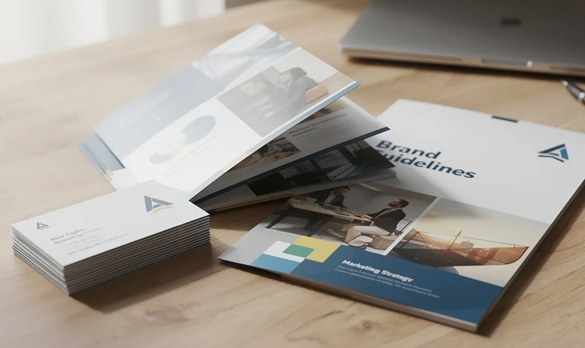
printed marketing materials, including brochures, business cards, and folders

Marketing materials are among the most common print projects. They’re designed to grab attention, communicate a message quickly, and prompt action—whether that’s visiting a store, attending an event, or making a purchase.

Common formats include:

  • Flyers and leaflets: A5 or US letter handouts used for local events, limited-time sales, restaurant openings, and community announcements. Design focus: bold headlines, clear hierarchy, and a single call to action.

  • Brochures: Bi-fold, tri-fold, and gatefold formats used by real estate agents, tourism boards, healthcare providers, and trade show exhibitors. These allow more space to tell a story while remaining portable.

  • Posters and banners: From small A3 prints in coffee shops to large-format concert announcements and festival graphics. Legibility from typical viewing distances is critical—what works at arm’s length fails at 20 feet.

  • Postcards and direct mail: Promotions mailed to homes, event invitations, fundraising appeals, and political campaign pieces. Direct mail continues to outperform many digital channels in response rates, with studies showing a large percentage of recipients take action within a week.

Effective marketing materials prioritize visual hierarchy, ensuring the most important information (headline, offer, date) stands out immediately. A cluttered flyer with too many competing elements will be ignored.

Stationery, identity, and brand collateral

Print design reinforces brand identity through everyday touchpoints. The business card you hand someone, the letterhead on your proposals, the folder holding your presentation—these pieces shape how people perceive your organization.

Core stationery items include:

  • Business cards

  • Letterheads and compliment slips

  • Envelopes (standard and custom sizes)

  • Branded folders and presentation materials

  • Notepads and sticky notes

Event-related stationery extends to invitations, save-the-date cards, RSVP cards, place cards, and thank-you notes for weddings, conferences, and product launches.

Smaller branded pieces also matter: stickers, labels, hang tags for clothing, membership cards, loyalty cards, and gift certificates. Consistency in logo usage, color palette, and typography across all these items builds recognition and trust—not over weeks, but over years of repeated exposure.

Publication and editorial design

Publication design covers long-form, multi-page works where layout and typography directly affect the reading experience. The multi-page layout and reading experience domain is where print designers become experts in grids, margins, and the subtle art of guiding a reader through pages of content.

Key formats include:

  • Books: Novels, textbooks, coffee-table art books, and reference guides. Page margins, type size, and line length all affect reading comfort during extended sessions.

  • Magazines and journals: Quarterly company publications, alumni magazines, industry journals, and consumer magazines. These balance text-heavy articles with photography, illustrations, and advertising.

  • Corporate reports: Annual reports, sustainability reports, investor presentations, and white papers. These documents represent organizational credibility and require polished, professional design.

Publication designers rely on grid systems to maintain consistent alignment across dozens or hundreds of pages. Running headers, footers, page numbers, captions, and pull quotes all require careful attention. The goal is invisible design—layouts so well-organized that readers focus entirely on the content.

Packaging and label design

Packaging design sits at the intersection of structural engineering and visual communication. Print designers must consider not just how something looks, but how it folds, protects its contents, and functions on a retail shelf.

Packaging applications include:

  • Boxes, sleeves, and cartons for consumer goods

  • Bottles, cans, and pouches for beverages and food

  • Mailer envelopes and shipping boxes for e-commerce

  • Blister packs and clamshells for electronics and accessories

Designers often create dielines—flat templates showing folds, flaps, glue areas, and panel boundaries. Understanding how a 2D design becomes a 3D form is essential.

Labels and wraps apply to products like wine bottles, craft beer cans, skincare products, and specialty foods. Beyond aesthetics, packaging must also accommodate legal and practical requirements, including barcodes, nutritional information, ingredient lists, safety icons, and recycling symbols. A beautiful label that lacks required information never makes it to market.

product packaging print design boxes and bottles with colorful printed labels and stickers

Environmental and large-format graphics

Environmental graphics take print design into physical spaces. Rather than handheld pieces, these designs guide, inform, and brand entire environments.

Applications include:

  • Signage and wayfinding: Systems for retail stores, corporate offices, hospitals, museums, and university campuses. Door signs, directional arrows, floor maps, and informational displays.

  • Trade show and event graphics: Pull-up banners, pop-up walls, backdrops, table covers, and fully branded booth environments.

  • Outdoor advertising: Billboards, bus shelter ads, building wraps, and transit advertising on buses, trams, and subway systems.

Design considerations shift dramatically at this scale. Billboards may be viewed for only 3-5 seconds from a moving vehicle, requiring ultra-simple messaging and high contrast. Large-format prints can use lower resolution (sometimes 150 DPI or less) because viewing distances are measured in feet, not inches.

Core principles and elements of effective print design

Print design blends timeless visual principles with technical precision unique to physical production. Whether you’re creating a tri-fold brochure or a 200-page catalog, the same fundamental elements and principles apply.

This section covers typography, color, layout, image quality, file preparation, and production choices. These basics form the foundation for any successful print project—and understanding them separates professional results from amateur attempts.

Typography and readability

Typography matters more in print than almost anywhere else. Readers can’t pinch-to-zoom on a printed page. The layout is fixed. Every type decision is permanent once ink hits paper.

Key considerations for print typography:

  • Typeface selection: Serif fonts (like Garamond or Times) traditionally work well for long-form body text in books and reports. Sans-serif fonts (such as Helvetica or Open Sans) often suit headlines, captions, and modern marketing materials.

  • Size and leading: Body text typically ranges from 9-12 points, depending on the typeface and medium. Leading (line spacing) should be 120-145% of the type size for comfortable reading.

  • Line length: Optimal line length runs 50-75 characters. Lines that are too short create choppy reading; lines that are too long exhaust the eye.

  • Hierarchy: Use size, weight, and positioning to distinguish headings, subheadings, body copy, captions, and calls to action. Readers should instantly understand what to read first.

Common pitfalls include setting body text too small (under 8 points), cramming lines too tightly, overusing decorative fonts, and failing to create sufficient contrast between text and background.

Color theory, CMYK, and spot colors

Color operates differently in print than on screen. Digital displays use additive RGB color (red, green, and blue light combining to create colors). Print uses subtractive CMYK color (cyan, magenta, yellow, and black inks layered on paper).

Practical implications:

  • All designs must be converted to CMYK before sending to a printer. RGB files will print, but colors may shift significantly—often appearing duller or muddier than expected.

  • CMYK values define ink percentages. A deep blue might be C100 M60 Y0 K10, meaning 100% cyan, 60% magenta, no yellow, and 10% black.

  • Pantone colors (spot colors) provide exact color matching across different print runs and materials. Brands with strict color standards often specify Pantone values to ensure consistency, whether printing business cards in January or packaging in July.

Colors almost always appear more vibrant on a backlit screen than on printed paper. Soft proofing (previewing CMYK output on screen) and ordering physical proofs before large runs helps avoid expensive surprises.

Layout, grids, and composition

Professional print layouts rely on invisible structure. Grids keep elements aligned across pages and panels, creating visual consistency that readers feel, even if they can’t articulate it.

Grid fundamentals:

  • Column grids: Divide the page into vertical columns for text and image placement. Common in magazines, newspapers, and catalogs.

  • Modular grids: Add horizontal divisions, creating a matrix of cells for more complex layouts.

  • Margins and gutters: Margins define outer boundaries; gutters provide space between columns or between facing pages in bound documents.

Beyond structure, effective composition guides the eye through a deliberate visual path. The headline grabs attention first; subheadings and imagery draw the reader deeper; and body copy provides detail. White space—intentionally empty areas—prevents crowding and gives designs room to breathe.

Overcrowded layouts are the most common mistake in amateur print design. When everything shouts for attention, nothing gets heard.

Resolution, DPI, and image quality

Print quality depends heavily on image resolution. Low-resolution graphics that look fine on screen become pixelated, blurry messes in print.

Understanding DPI and resolution is critical; this is the standard specification:

  • 300 DPI/PPI at final print size for high-quality offset printing

  • Images should be prepared at this resolution before placement in layout software

  • Enlarging low-resolution images doesn’t add quality—it just makes pixels bigger

Large-format prints (billboards, building wraps) can use lower effective resolution because they’re viewed from greater distances. A billboard might use 50 DPI and still appear sharp from the road.

Never grab images from websites and drop them into print layouts. Web graphics are typically 72-150 PPI—fine for screens, disastrous for print. Either source high-resolution originals or accept that the finished design will disappoint.

File formats, bleeds, and print-safe margins

Proper file preparation directly affects whether your design prints correctly. Sending the wrong format or omitting technical specifications can delay production and lead to costly reprints.

Essential file prep:

  • Final format: Print-ready PDFs (often PDF/X standards) with fonts embedded and images at full resolution. While designers work in native file formats like INDD, AI, or PSD, printers typically request PDFs.

  • Bleed: An extension of artwork beyond the trim edge—usually 3mm (0.125 inches) on all sides. Any background color, image, or graphic that touches the edge must extend into the bleed area. This prevents white slivers from appearing if the cutting alignment shifts slightly.

  • Safe margins: The inner zone where all critical text and logos must remain. Typically 3-5mm inside the trim line. Nothing important should approach the cut edge.

Forgetting bleeds or placing important elements too close to trim lines are among the most frequent causes of print production problems.

To ensure proper bleed, visit How to Add Bleed in Photoshop and How to Add Bleed in Illustrator.

Paper, finishes, and production choices

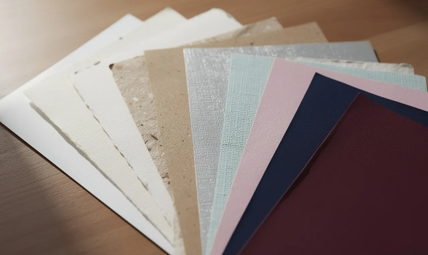
variety of paper samples with different textures and colors fanned out on a table

The same design can feel completely different depending on the paper type, stock, and finishing techniques. Material choices transform a generic brochure into a premium piece—or undermine an otherwise strong design.

Paper considerations:

  • Weight: Measured in GSM (grams per square meter) or pounds. Office paper runs around 80 GSM; business cards typically use 300-400 GSM stock.

  • Coating: Gloss coatings create vibrant colors and shiny surfaces. Matte and silk finishes offer softer, more subdued appearances. Uncoated stocks feel more natural and tactile.

  • Texture: Smooth, linen, laid, and specialty textures each create distinct impressions.

Special finishes add further dimension:

  • Foil stamping: Metallic or colored foil applied to specific areas

  • Embossing/debossing: Raised or recessed designs pressed into the paper

  • Spot UV: Glossy varnish applied to selected elements while the rest remains matte

  • Soft-touch lamination: A velvety, tactile coating

These production choices affect cost, turnaround time, and color appearance. Glossy stocks make colors pop; uncoated papers absorb more ink and appear more muted. The key is matching production choices to project goals and budget—ideally by consulting with your printer early in the design process.

Print design vs. digital design: how they differ and overlap

Print design and digital design share fundamental principles—typography, color theory, composition, and hierarchy apply to both. But the medium changes everything about constraints and creative possibilities.

Key differences include:

  • Fixed vs. responsive: Print layouts are fixed to specific dimensions. A poster is exactly 24×36 inches. Digital interfaces must adapt to a wide range of screen sizes, from mobile phones to desktop monitors.

  • Color modes: Print uses CMYK; screens use RGB. Designs must be converted appropriately, and colors that look identical on screen may diverge significantly in print.

  • Resolution requirements: Print demands 300 DPI for quality reproduction. Digital images are measured in pixels and can vary widely based on display and context.

  • Interactivity: Print is static. Digital design includes clicks, taps, scrolls, hover states, animations, and video. A printed brochure can’t play a video—but it also can’t crash, load slowly, or get blocked by an ad blocker.

  • Permanence: Once printed, a design cannot be updated. Errors require reprinting. Digital content can be revised instantly at minimal cost.

Where they overlap:

Many modern projects require both print and digital deliverables. A product launch might require printed packaging, point-of-sale displays, trade show banners, social media graphics, email templates, and a landing page. Graphic designers increasingly work across both mediums, adapting a single visual system to different technical requirements.

print design vs digital design

The smartest approach treats print and digital as complementary channels. A direct mail piece drives recipients to a website. A printed catalog inspires online purchases. A poster includes a QR code linking to augmented reality content. Rather than choosing between media, effective brand communication leverages each for its unique strengths.

Best practices for creating successful print designs

Before sending any project to production, run through these practical checkpoints. They’ll help you avoid common mistakes and ensure your printed materials look as good in hand as they did on screen.

Define purpose and target audience first

Every print project should answer clear questions: What should the recipient do after seeing this piece? Visit a website? Attend an event? Remember the brand? Clarity on purpose shapes every design decision.

Confirm format and specifications early

Decide on dimensions (A4 flyer, DL brochure, US letter tri-fold, A2 poster) and verify requirements with your printer before designing. Different printers have different templates, bleed requirements, and file format preferences.

Keep layouts focused

Resist the urge to fill every inch of space. White space improves readability and draws attention to what matters. This is especially critical in small formats like business cards or postcards, where crowding quickly becomes overwhelming.

Proof rigorously

Check spelling, dates, prices, phone numbers, email addresses, and QR codes. Have at least one other person review before printing. Errors in print are permanent and expensive.

Print test copies

Even a basic office printer can reveal layout problems—incorrect margins, awkward text breaks, or low-resolution images—before you commit to a full production run.

Collaborate with your printer

Involve production partners early. They can confirm bleed sizes, recommend paper stocks within budget, explain finishing options, and flag potential issues before they become costly mistakes.

Consider sustainability

Environmental impact matters to many audiences. Options include recycled papers, FSC-certified stocks, soy-based inks, and efficient print runs that minimize waste. Some waterless printing techniques reduce water use significantly over their traditional counterparts.

How print design fits into modern marketing and branding

Print design doesn’t exist in isolation. It’s a vital part of broader brand and marketing strategies, reinforcing visual identity across countless touchpoints—from the box a product arrives in to the business card exchanged at a conference.

Consistent print materials build recognition. When your brochures, stationery, packaging, and signage all share the same typography, colors, and design language, audiences instantly recognize your brand. This consistency compounds over time, building trust and familiarity.

Print also drives digital actions. QR code marketing on postcards link to landing pages. Personalized URLs on direct mail track campaign responses. Printed coupons are redeemed online. The line between physical and digital continues to blur, with augmented reality markers increasingly appearing on print pieces to unlock interactive experiences.

Currently, omnichannel campaigns are standard practice. Graphic designers create visual systems once, then adapt them for posters, flyers, catalogs, social media posts, email banners, and web ads. Understanding both print and digital requirements is no longer optional; it’s expected.

Print often signals investment and seriousness. A hardcover company history communicates permanence. A carefully produced catalog suggests quality products. Premium product packaging elevates perceived value. Studies indicate professionally printed materials can increase perceived brand value.

Understanding what print design is—its technical requirements, creative possibilities, and key differences from digital—helps businesses and designers create more memorable, effective communication. In a world flooded with fleeting digital impressions, something you can hold in your hands still carries remarkable power.

Whether you’re planning your first brochure or overseeing a complete brand identity system, the basics covered here provide a foundation for print projects that look professional, communicate clearly, and deliver results.

Clash Graphics Print Shop Atlanta Flyer Printing
2233 Peachtree Rd NE Ste 202 Atlanta, GA 30309
(678) 235-3464

To view the original version on Clash Graphics, visit: https://www.clashgraphics.com/printing-tips/what-is-print-design/

Monday, March 20, 2017

Marketing your Business or Product with Custom Stickers

custom stickers to market a businessStickers have always been a part of advertising campaigns thanks to their durability, affordability, and eye-catching nature. With the help of digital printing technology there are now endless possibilities when it comes to designing stickers. It’s also never been cheaper to order the finished design in bulk packages.

Stickers remain one of the most versatile and affordable marketing solutions on clashgraphics.com. Below we’ll be taking a look at the advantages of stickers, along with where to leave them and how to benefit the most from using them as a part of your marketing and promotional campaigns.

Everyone Loves Stickers

Who doesn’t love sticking stickers? I’m not sure if they love it because of the way the adhesive smells, or if they just get a kick out of decorating things with stickers, what matters most is that everyone loves doing it. How many laptops and car bumpers have you seen plastered in stickers? These stickers have meaning and they have value because they let people express themselves and the brands they use and associate with. With some cleverness, a polished design, and in particular if you have a lifestyle brand, you can be sure that someone will use your stickers to decorate something.

Design the Stickers to Fit the Brand

One of the main benefits to using stickers is that they can be custom designed to generate a great response from a small budget. There are many ways to customize stickers, including all the different shapes, sizes, and colors they can be printed in. You can create a star-shaped sticker, a round sticker, or a sticker that has been meticulously cut into the shape of the logo of your company. Get creative with the design and consider how you want the stickers to be used.

Best Places to Put The Stickers

One of the most important things in marketing is novelty. Your stickers will get more attention if they are left in unexpected places. If the sticker shows up in a surprising place, then the customer is more likely to see it and pay attention to it. The following are some for the best places to put the stickers.

stickers on the window of a business

On an Entrance Door - Plenty of companies have found creative ways to use glass entrance doors as part of their sticker marketing campaign. Find ways you can take advantage of the movement and transparency of glass doors to enhance and promote your brand in clever ways.

In restrooms - Public restrooms are a great place to put stickers, whether on the mirrors, the hand dryers, the floors, the sinks, and even in the stalls. There’s generally only one place for your eyes to go when you use the lavatory. Putting the right sticker in the right place creates a compelling message and is an effective way to deliver a sales pitch.

On walls or ceilings - If there’s some big sales event at the retail location, then you should plaster the walls in stickers to draw the attention of customers, create interest, and deliver a call to action. Ceilings are another good place for stickers, especially in places where customers will spend time looking up (such as using a dentist char, in the mall, or climbing stairwells). Custom stickers are a great way to create an effective marketing campaign.

Affordable and Efficient All-Purpose Marketing Material

If you’re looking to reach a large audience and improve product awareness, then this simple but impactful marketing method is a solid choice. There are plenty of different ways to promote a brand, but not many of them are as effective, affordable, and attention-grabbing as a good custom sticker. Durable stickers produce great results in the short-term, with a lifespan that allows them to continue to deliver in the long-term. Investing even a small amount in custom stickers boosts sales and brand awareness, while being so cheap that it pays for itself plenty of times over.

Clash Graphics Print Shop Atlanta Flyer Printing

2233 Peachtree Rd NE Ste 202 Atlanta, GA 30309

(678) 235-3464

To view the original version on Clash Graphics, visit: http://www.clashgraphics.com/printing-tips/marketing-your-business-or-product-with-custom-stickers-/

Sunday, August 28, 2016

4 Marketing Mistakes Startups Should Avoid


A successful startup is only as good as its marketing strategy.

If you provided the best service in the world, or sold the greatest product out there, but no one ever heard of it, can you call yourself a success? Of course not.

Understanding how to properly convey your message without error is something every entrepreneur aspires to do. Here are some marketing mistakes to avoid if you are a startup business:

Not Understanding Your Target Market


Even though it would be great if everyone wanted to buy products from you (and you alone), that’s just not a realistic expectation. A potential customer will be inclined to buy from you if they know you have what they want.

Taking time to understand buyer behaviors of your target market allows you to personalize your marketing campaigns and messages, so a customer feels confident your service or produce will solve their problems.

Trying to speak to everyone is a waste of time. Isolate potential customers who are likely to buy from you.

Not Researching Your Audience


Test your marketing strategies and ask for feedback. Don’t just request opinions from your inner circle - venture out to strangers and get their honest thoughts. If you are pitching an idea to an investor, they are going to ask questions about your audience, including its size and whether you already are making sales.

They will want to see statistics and research to back up your claims, and to determine if your idea has wheels and is proven to be in demand. Without figures or sales to back up your claims, the only thing you can hope to do is capture interest from your idea, which is substantially harder.

Putting Too Much Emphasis on Marketing Materials


We all want stylish websites and promotional materials (flyers and business cards). However, the aesthetics alone shouldn’t be the focal point. The problem your product or service solves is what you should be emphasizing. Focus on establishing a reputation from producing value and delivering exceptional quality. When you develop something people anticipate, you’ll actually create a buzz and genuine discussion. Not to say that flyer marketing, a website or marketing materials won’t help, but alone they can't determine your success.

Putting Just Anyone in Charge


Trying to do everything “because I will do it better” is a mistake most entrepreneurs make. Employ a marketing director or team dedicated to help, no matter how small your business is. The launch of a startup involves a lot of work, and should be done well, not ‘as best you can’.

Use experts to handle the important things you don’t have time for. Don’t use an intern or anyone not proficient at a specific task. If you need someone to run your social media accounts, make sure that person understands the fundamentals of social media marketing. Ensure that the person you delegate things to is on the same page as you, in order to keep your brand’s message and appearance consistent.

Learning about your target market and establishing a customer base are critical elements for a successful startup. Keeping experts in charge of things you’re not doing regularly is just as important as having a strong product or service.

The sooner you avoid these pitfalls, the quicker your startup business will become a reality and success. Our printing and design experts would be glad to help create your brand identity or marketing materials. Browse our site or call us today at 678-235-3464.

Originally published on: http://www.clashgraphics.com/printing-tips/4-marketing-mistakes-startups-should-avoid/