Keep your logo and its design from misrepresenting your business and its values. Understanding how logo shapes impact messaging will help you craft a logo that meaningfully represents your business and its direction.
clashgraphics.com gathered the following information, definition, and tips about powerful logo shapes that can accurately represent your business to its audience and customers.
Logo Shapes
A logo shape is what makes your business and products recognizable over time. You may not have enough time to read the message on a billboard while speeding down the highway, but you will undoubtedly remember the logo in the ad. A logo’s shape and color can remind consumers of the brand, their experiences with it, and how they feel about it.
While brand recognition is one thing, psychology is also at work. A shape invokes a feeling, and successful brands will manipulate their logo design to attract these feelings. Consider the following shapes and what they can represent:
Rectangular Logos
With a balanced nature and defined sides, rectangular logos represent stability, balance, reliability, professionalism, boldness, and confidence. Rectangular logos could be vertical, horizontal, squares, diagonally placed or represented in a 3D depiction.
Intention: Squares and rectangles convey feelings of stability and balance. Subsequently, psychological associations of reliability and stability occur.
Triangular Logos
Triangular logos represent a definitive target. They may represent ambition, focus, science, knowledge, wisdom, excellence, and performance.
A triangle could represent a graph, the way Adidas uses a design that speaks of performance. Or a three-pointed star like Mercedes Benz has owned and used for generations.
Like other logos, a triangle can be integrated with different shapes. The YouTube logo, for example, puts a play button on a rectangle field of red.
Intention: Triangles are a flexible but less common logo shape. Triangles represent stability and ingenuity, as well as the arts. The harsh lines and geometry of triangles can result in very playful logos.
Horizontal Lines in Logos
Logos that inspire secure, well-structured, powerfully grounded, stable, calm, and assured feelings will likely contain horizontal lines.
An example of a horizontally lined logo design is the AT&T logo. As a telecom provider, the lines seem to wrap around the globe, assuring consumers that they will be connected in any corner of the world.
Intention: Horizontal lines also represent dynamism and movement. Delivery companies often add horizontal lines to their logos to convey motion and speed.
Vertical Lines in Logos
Vertical lines can be used to symbolize progress, performance, measurability, achievement, strength, and possibilities. Successful brands use vertical lines in their logos to prove a point.
Intention: Vertical lines strongly suggest stability, strength, and balance. The precision of vertical lines also conveys professionalism. They are often used in corporate logos to promote a sense of professional integrity, reliability, and efficiency.
Organic (Natural) Logos
Organic or natural logos are a representation of creativity. They convey a message without conforming to shapes and geometric design. Natural logos are often inspired by everyday geometry around us. These logo designs are governed by the principles of naturally occurring elements (plants, animals, faces, etc.). The Ferrari logo, for instance, represents the speed of the racehorse on a field of yellow (representing the city of Modena).
Intention: Nature-inspired logos have the power to connect instantly with consumers. These logos invoke feelings of protection, trust, and safety. A company may also use a nature-inspired logo to convey an eco-friendly message.
Circular Logos
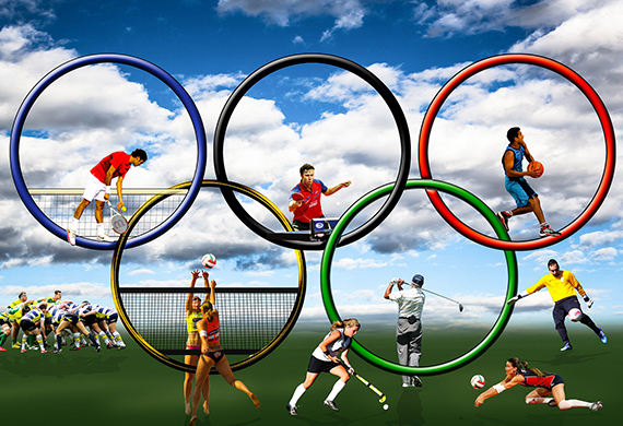
Absent of sharp edges, circles are the most wholesome and comforting shapes in the world. Ellipses, ovals, or perfectly round, circular shapes make excellent background components for your brand. They symbolize continuity, safety, reliability, completeness, and perfection.
Brands often combine multiple circles to symbolize different things. The Olympics logo stands for different groups of individuals uniting in the spirit of competitive sportsmanship.
Intention: Circles are universal symbols of wholeness, perfection, completeness, and cyclic motion. They also represent community, friendship, and inclusivity. Circular logos are one of the most popular logo shapes.
Abstract Logos
These logo shapes allow creators to be unique while creating their own shapes and forms.
Among the most recognizable logos in the world is the Nike Swoosh. Today, the logo is so well-known that the brand can place the logo on a product and in marketing campaigns without using any writing.
While Nike’s logo may look like a simple check mark, much thought has gone into it, resulting in its present, minimal rendition.
Intention: An abstract logo is a symbol or image that conceptually represents your business. More importantly, abstract logos can infuse layers of meaning into an image, making yours distinct and memorable.
Brand Recognition
Larger companies have vast budgets and resources to commit to designing long-term brand equity. In comparison, smaller companies won’t always have that luxury. A small local company’s logo’s visual appearance (shape, color, design, etc.) may be what attracts its customers. In such cases, the initial reaction to a logo may have long-lasting impacts on a business’s success and brand.
Logo Design
In this article, you saw logo examples, discovered essential information and tips on what different logo shapes represent and how they convey messages.
Using the right design in your company’s logo can help your customers recognize your business at a glance, trust your products, and invest their loyalty in your brand.
Ignoring the need to use representative shapes in your logo can lead to severe misunderstandings about the intentions and quality of your company and its products.
Sources:
uxplanet.org/knock-design-into-shape-psychology-of-shapes-6e43c6e59955
knowledge.insead.edu/marketing/how-your-logo-shapes-consumer-judgments
mbp9807.cad.rit.edu/interactive1/project2/myarticle.html
cis.rit.edu/htbooks/dtp/elements/shape.html
Clash Graphics Print Shop Atlanta Flyer Printing
2233 Peachtree Rd NE Ste 202 Atlanta, GA 30309
(678) 235-3464
To view the original version on Clash Graphics, visit: https://www.clashgraphics.com/printing-tips/powerful-logo-shapes-for-your-business/