Prevent losing potential business and the embarassment of a poorly designed business card. Knowing how to produce a business card that is sharp and focused will be compelling and help keep your audience engaged.

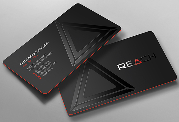
Business card by chandrayaan.creative
clashgraphics.com gathered the following information and strategy tips about what to put on your business card.
Information To Include on Your Business Card
Knowing what information goes on a business card, what should be left off, and how to use negative space will give you the means to create a unique and memorable business card. Consider the following:
1. Company or Business Logo
A well-designed logo is informative, practical, graphic, and straightforward. Usually, you’ll find a developed concept or “meaning” behind an effective logo, and it effortlessly communicates the business’ intended message. A well-designed logo can make your company appear credible, professional, and trustworthy. Three common types of logos include:
- Monogram or Letter Mark - These logos are composed of the initial letters of your business creatively organized. Abbreviating makes sense if you have a long name, like United Parcel Service (UPS).
- Written Name - Also known as a wordmark, this is a written-out representation of your brand. Many iconic brands use wordmarks, such as Mercedes, Kleenex, and Nike.
- Symbol - This representation of your business is image-based. It can be a simple shape related to your area of expertise or an abstract form representing your brand. It can stand alone and support your written business name. The red, white, and blue Pepsi logo, the Apple, the swoosh, and McDonald’s golden arches are some of the more widely recognized.

Bobboz - stock.adobe.com
Note: Your logo should ideally work in black and white (for basic applications) and be scalable (from stamp-sized reproductions all the way up to posters or banners). Try not to add text too close to the logo or scale it too big. And remember to let it breathe. That’s what makes it stand out. If it looks cramped, scale the logo down a bit and increase the amount of space around it.
Tip: Your logo should work in both color scale and black and white, besides being scalable from postage stamp to poster size.
2. Company or Business Name
Your company’s or business’ name is what people will most likely remember. As such, the name of your business should be the most prominent (largest) component of text on your card.
3. Tagline
This 5 to 6 word (maximum) phrase summarizes what your business is about. It conveys your business identity to the individual. A tagline will help ensure that your brand is instantly recognizable. Shapes, colors, and words used creatively can make a powerful tagline. Each element should come together to form the heart of your branding. Some examples include:
- California Milk Processor Board - “Got Milk?”
- Dunkin Donuts - “America runs on Dunkin”
- Disney - “Happiest Place on Earth”
- McDonald’s - “Lovin’ It”
- Verizon - “Can You Hear Me Now?”
- Nike - “Just Do It”
- KFC - “Finger-lickin’ good”
Tip: The more simple and concise your tagline is, the more memorable it will be.
4. Your Name
Make this text field significant. It will help people remember your name and create a personal business connection.
5. Your Job Title

Business card by Ivan
Not everyone’s good with names, and your job title works well to jog a person’s memory. Some people are more likely to remember you for your title or position.
6. Contact Information
Contact information can be aligned left, right, or centered. You can emphasize your preferred contact method, like a phone number or email address with a larger size or more prominent placement.
Tip: If you operate your business from a brick-and-mortar location, your address is crucial to increase potential foot traffic. If you work virtually or do not depend on foot traffic, you can leave it out and save the space. However, your phone number and email address are essential components; most people will contact you this way.
7. Website Address/Landing Page
You can stop using the “http://“ from your web address. It’s not necessary and takes up valuable space. It’s essential to be consistent between the design of your business card and your website, refer to your website when designing a business card or refer to your business card when designing your website.
Tip: Use a QR code that automatically sends you to a greeting page on your website made specifically for those visiting via business cards. This will allow you to track new visitors and their activities.
8. A Promo or Call to Action
Include a call to action or promo code for a product or service. This will help you measure who is looking at and engaging with your business card after a meeting or event.
It’s not the best way to measure results (many people never redeem promos), but it helps you provide users with something in exchange for their time. An enticing call to action or promo can drive traffic to your website or generate new emails or phone calls.
Types of Business Cards
Just as important as the information you are designing onto your card is the type of card you want to use. Consider the following when selecting your business cards:
- Thicker cards (34 points are considered double thick) make painted edge business cards stand out spectacularly.
- Laminated cards (silk satin, soft velvet, UV gloss, etc.) tend to last longer and have an excellent presentation.
- Raised foil, laminated foil, and akuafoil business cards allow you to truly express how dynamic your creativity can reach.
- Cotton, linen, recycled cardboard, and uncoated business cards allow you to personalize them by writing directly on the card.

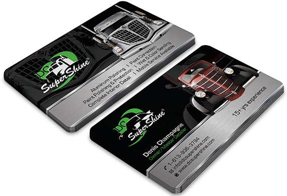
Card design by Fishing Artz
Explore more options and configurations by visiting clashgraphics.com/business-cards-printing-in-atlanta
What Goes on a Business Card?
Just because you want a business card doesn’t mean you have to be boring about them. Produce a functional card that helps your contacts/customers find their way to your marketing funnel. Make a great first impression with a strong business card design that lets people know who you are and what you are about. Use high-quality paper and printing techniques to solidify that impression.
Find assistance with a professional graphic design team at clashgraphics.com/graphic-design/
What to Put on a Business Card
In this article, you discovered information and tips for what data should be included in your business card design.
Increase your audience size and generate more revenue by being precise and result-driven when developing your business cards.
Avoid losing revenue and business volume from poorly designed business cards that complicate your audience’s ability to communicate with you.
Sources:
sessions.edu/notes-on-design/3-ways-to-design-a-better-business-card/
freelogodesign.org/blog/2017/03/09/business-cards-the-dos-and-donts
apfmnet.org/what-does-your-business-card-say-about-you/
socialmediaweek.org/blog/2015/01/business-cards-still-matter-effectively-use/
Clash Graphics Print Shop Atlanta Flyer Printing
2233 Peachtree Rd NE Ste 202 Atlanta, GA 30309
(678) 235-3464
To view the original version on Clash Graphics, visit: https://www.clashgraphics.com/printing-tips/what-information-to-put-on-a-business-card/
No comments:
Post a Comment